
 |
| Styling: Myself |
Last week I presented you my styling for the Danish design brand &tradition in the Norm studio in Copenhagen HERE. I also shared small teasers of my fellow bloggers' works, but today I want to share their works in more detail here as promised. Even though we all styled in the same studio with the same set of products and props, I think that everyone of us created a very personal vignette that tells an individual visual story. Judge for yourself and see the eight styling vignettes in detail here.
 |
| Styling: Nina / Stylizimo |
 |
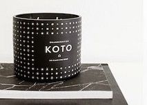
| Styling: Gerard / Walnut Grey Design |
 |
| Styling: Anna / La Maison d'Anna G. |
 |
| Styling: Agata / I Like Design |
 |
| Styling: Desiree / Vosges Paris |
 |
| Styling: Emma / Emmas Designblogg |
 |
| Styling: Allan / Bungalow5 |
P.S. Next Tuesday we are back to the regular 'Why This Room Caught My Eye' series.
Photography by Rune Lundø


Nice styling! I like the first and last pictures most, because they teases one to think - they tell a small story. The first picture is nice with the pink cord leading to the word happy (and one starts to question - what makes me happy?). The last picture is very powerful, but I am not sure if it is sending positive or negative vibes.
ReplyDeleteThe rest of the pictures are all beautiful, but they present only "things".
Excellent remarks, Katja! I'm intrigued about the way people perceive stylings. Thanks for sharing your thoughts!
Deletei agree with katja - i also like the first and the last one the most. the first one because of pink as a highlight. a contrast to all the grey. and the last one because having a human being on a pic makes it more vivid although the colours are dark and similar.
ReplyDeleteGood points, Stefi! As for colours, I couldn't help but use the one colour that was available:-) and I share your point regarding people in styling shots - it adds a dimension to the entire storytelling.
DeleteI'd hire every one of these stylists ;-)
ReplyDeleteI identify most with my own pic (go figure). In my head I had ‘Monocle Man’... having arrived back at his apartment, Monocle Man punctiliously rests his bag, copy of Monocle and iPad on the Hoof table, removing and placing his glasses and headphones. It's really about a guy arriving home to his beautiful abode. Now maybe I could have improved this image by actually being in the image or using another guy for the image.
I think that with styling the viewer needs to look for a story or make one up for themselves. Of course there needs to be that initial connection... maybe with the space, a word, person, product or colour et cetera. I can see why both 'happy' in pink and Allan lying as he is will draw the eye. I also like to see people in styling pics.
Thank you Igor :-)
I can absolutely relate to your great styling, Gerard (not only because of my bag there:-)). I love the connection if a styling to the mundane of our lives - something that will tell me this could be me, this could be my home. And consequently it would inspire me either to change something at home, buy the product or to the least consider my home styling with more attention.
Deletesome time ago, I didn't understand styling pojects, but now ... after my blog adventure I love to watch picture like this! Oh, I saw, that thre is also polish accent :) from Agata. So nice to see!
ReplyDeleteok, now my opinion, the last picture: absolutely " fallen but stil life" :)))
I like Gerards composition for that severe and varied background, but also your stylization looks nice for pink deails and lovelu washi tape :)))
Thank you for your thoughts! And yes, we had a good international styling flavour here including a Polish note!
Deletethe first one, because it connects various parts of styling -> fashion (the jacket), architecture (this plain and industrial style of the room/the metal line at the wall), interiour (the stool, the cup and also the books) and of cause because of the pink that can be found at the happy/book/lamp and that is a perfect contrast to the white/grey/black * julia
ReplyDeleteGreat, Julia! I feel flattered! I really love that you analyzed all pieces separately and highlighted them!
DeleteBecause of our tremendous heatwave - I immediately zeroed in on the fan. I like the way it is a study in soft curves & round shapes.
ReplyDeleteWell observed, Cyndi! I really like Desiree's styling, it looks like out of a magazine!
DeleteNice styling. I have one word in mind: harmony. And I laughed out loud when I saw the last picture. :-D
ReplyDeleteHaha, the last pic is the blogger harmony overkill:-))
DeleteLieber Igor,
ReplyDeleteich möchte mich nicht entscheiden - ich kann nur sagen: genau aus diesem Grund Blogge ich und stöbere so wahnsinnig gerne auf anderen Blogs .... so viele verschiedene Menschen, und jeder hat seinen eigenen Style - jedes dieser Bilder ist toll! So einzigartig wie jeder Mensch ist, so einzigartig sind auch diese Styles mit super Details.... Bilder mit Maskingtapes, die Brille auf dem Tisch oder die Glühbirne der Stapel Bücher daneben (ich bin Detailverliebt) - I love it all.
Ganz liebe Grüße Anja
Du hast vollkommen recht, Anja, und ich teile Deine Meinung! Das beste hier ist, dass ich die Blogger ja alle persönlich kenne, die diese Stylings gemacht haben und es ist tatsächlich so, dass jedes Styling dem Charakter des Bloggers ziemlich genau entspricht!
DeleteWow-how fantastic are all of these! You guys had such an amazing time! First off Igor-brilliant styling Igor-congratulations! They really are all so great in different ways, but I particularly like those by Anna, Gerard and Allan for the sheer wit of it all-very Tracey Emin! :-)
ReplyDeleteThanks for your feedback, Caroline. I was a bit challenged as I'm not used to making my own styling vignettes out of my home. And now I have to look up for Tracey Emin:-)
DeleteI love all the photos, number 2 are my favorite! :)
ReplyDeleteBest regards
Stian N. Moen / Noreen Interior
Thanks for your vote, Stian! Nina's styling is beautiful indeed!
DeleteI honestly can't pick one! Love the shots of hot pink in your vignette and I love all the other ones as well. They all look so good and I just loved the one by Allan ... just put a smile to my face.
ReplyDeletethanks for sharing Mr. and so jealous of your fun at Copenhagen!
Actually, Allan hasn't done the styling, he was just so dead tired of us that he broke down on the set LOL Of course, I am joking:-)
DeleteThis is SO MUCH FUN! I love to see all of the 'same same but different' styling jobs. I LOVE your pops of pink and my other favorite is Anna's--I love how casual hers is. FUN!
ReplyDeleteThank you, Justina!! I too like the fact that we worked with the same materials and yet every style tells another story. Thanks for the compliment - I once did a styling course by a pro and learned heaps;-))
DeleteI love what you did there, Igor! As Katja said, you told a whole story with these few items. And I loved the last one, too.
ReplyDeleteThank you Chedva! I really fell happy about the outcome and positive feedback here!
DeleteEnjoyed them all, really!
ReplyDeleteFavs are yours, Gerards, Anna & Emma for all different reasons.
Well done to the lot of you:-)
Thank you, Tina! Much appreciated!!
DeleteThis is me catching up a bit!
ReplyDeleteFunny, I saw that top photo, saw the words 'happy' and thought to myself, this is so Igor! I didn't notice the caption under the photo before I started browsing.
I'm going to speak frankly and taking the risk of probably sounding negative, which is not my intention. I was scrolling down and honestly felt a bit bored. It has nothing to do with the work of those who did the styling; it's about this not being my thing and the images maybe having a cold quality to them (I'm all about summer blossoms, roses and gardens these days!). So when I reached the bottom photo, the work of Allan, it was such a wonderful surprise that I totally fell for it. So with the greatest respect for everyone involved, Allan gets my vote ;-)
I agree that Allan's work stands out as he used himself as part of it:-) The cold vibe of the pics is of course mainly rooted in the brand's visual identity and matches the desired aesthetics. But I agree, it's not everybody's cup of tea. As you see, I had to sneak in a bit of colour myself:-)
Delete