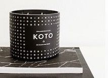
It's been a week now that I am back from the Maison & Objet design show in Paris. It was my third design trade show in a row this year and even though I visited it last year too (read all about it HERE), I was once again overwhelmed by the incredible size of the fair and the number of exhibitors. Truth be told, you'd need several days to grasp the full scope of the Maison & Objet show, I however tried to round up a few highlights in one single afternoon. Well, let's roll with some more interior design highlights, this time from the French capital Paris:
Subtle and Saturated Colours: One of the repeating observations during this year's design shows is that the colour palette has become more subtle, more saturated and calm - gone are the years of flashy neon hues and very bright hues. Full, velvety blues like indigo, lots of grey hues, soft and pale pinks, many neutrals and a repetitive pop of warm, saturated yellows - these colours seem to play a major role in 2014. I loved the use of colours at the stand of the Croatian furniture brand Prostoria but also the playful use of colours at the Design Letters stand or at the House Doctor stand.
Marble, Concrete, Leather, Copper, Brass, Wood: These materials have been playing a major role on many exhibitors' stands. The combination of various textures and nuances, warm and cold surfaces, creates a visual and haptic tension that will be definitely trending this year. The Scandinavian brands are leading this interior design trend - just have a look at the new collections of Menu, Normann Copenhagen, &Tradition and more. Wood furniture lovers should check out the British brand Case Furniture.
Indoor Plants: A movement in interior design I am particularly fond of is the revival of green interiors through indoor plants. Many stands have used indoor plants and entire plant walls to accentuate their collections and visualize the idea of a stylish home in 2014. Some brands have even exhibited dedicated furniture pieces that embody the use of indoor plants such as the French brand Bellila. A real highlight for myself!
Individuality and Playfulness: Ok, this is no revelation or news for most of us - but many brands showcased their desire for more individuality and playfulness in interior design. Be creative, combine playfully and forget old, traditional rules - get on a trial-and-error sort of interior design adventure and recreate your space continuously for more happiness. I loved how fun this was shown by brands like Seletti, Room Copenhagen or 19 Greek Street with their new collection Re Imagined made of vintage and new reupholstered furniture.
Unpretentious Luxury: Brands like the French furniture maker Cinna or the stand of Tom Dixon who was awarded 'Designer of the Year of the Maison & Objet 2014' succeeded in interpreting luxury in a new and rather unpretentious way. Luxury in interior design was mostly conceived as overdone and really over-the-top with everything: materials, patterns, prices. But brands in the upper price scale seem to tone down on the visual aggressiveness and portray a rather calm, unpretentious way of highlighting premium quality.
I hope you enjoyed this little interior design round-up from this year's Maison & Objet show in Paris. Later this week I will be off to the Furniture and Lighting Fair in Stockholm so there will be more interior design news on the blog soon. Stay tuned!
Happy week, friends!
Photography by Igor Josifovic


bakır'a bayıldım
ReplyDeletenever thought I would see the day when I love yellow, but I do . . . possibly the tone and the context is what has changed but am definitely warming to it!
ReplyDeleteI like that - yellow is a favorite accent colour but I like more saturated, warm yellows, not too bright ones.
DeleteUnbelievable how many pretty thing are at that fair!
ReplyDeleteΠραγματι βλέπω πολύ γκρι και χαλαρά χρωματα να παίζουν στα έπιπλα.
ReplyDeleteΕυχαριστη αλλαγή θα ελεγα. Πολύ θα θελα να επισκεφτώ την εκθεση καποια στιγμή!
Να έχεις μια όμορφη εβδομάδα :)
hej igor, sag, stammen die schoenen hoelzernen pflanzenstaender auch aus dem hause Bellila? ich konnte diese auf der unternehmensseite nicht aussmachen ...
ReplyDeletefreundlich grueßt
rike
Hi Rike, ja das ist deren brandneue Kollektion, die noch nicht mal auf der Website zu finden ist. Ich werde aber bald einen ausführlichen Beitrag zu Bellila schreiben und mehr Infos zu den neuen Produkten dann haben. Stay tuned!
Deletevorfreudig :)
DeleteI just want these SUN lights!!!! Perfection!
ReplyDeletewww.stylentonic.com
Oh yes, I'd love to have those too - especially on such gloomy days as today here in Munich! Xairetismous!!
DeleteHey Igor. You've rounded M&O up well in your usual wonderful happy style. I have to say though... I may have found the going tough had I been visiting. There's a lot happening from what I can see in your shots.
ReplyDeleteI know we have a difference of opinion when it comes to trends... but thanks for your insights :-)
Your feedback is ALWAYS welcome, my friend! And I appreciate our differences of opinion - it makes the entire thing more balanced and lively. And trust me, everytime I typed the word TREND I was thinking of you with a sort of anxiety. LOL
DeleteThere was SO much goodness at M&O, but you made such a lovely selection! Love that red neon color of those "tube" chairs! And the green furniture by Bellila was amazing too. Go Greens!!
ReplyDeleteI will definitely write a more detailed post on Bellila - it was a great discovery and I do love French brands as it is quite a novelty to me!
DeleteThank you, Igor, for the visual tour. The news about the more subtle colour palette is like music to my ears. All that gorgeous glassware in photos #3 and #8 has me swooning. It was only yesterday that I was showing my husband a photo of a huge glass vase with blooming branches - the ideal spring look - and saying we needed that in our new home!
ReplyDeleteYou're welcome, Lisa! And yes, huge glass vases in neutrals or smokey greens are just beautiful for spring - especially when placed in front of a window, I like how the sunlight creates various effects by shining through the vase. You should definitely go for it!
DeleteI like the colour palette for 2014 and also the indoor plants concept just as much as you! Fresh and clean execution with a nice natural touch. Thank you for the walk-through! I hope to get to see it for myself soon.
ReplyDeleteThank you for your feedback, Julie!
DeleteA great summary of M&O. Your pictures look so beautifully calm and tranquil. How did you manage with soo many people around?
ReplyDeleteIt was tricky indeed, Sabine. But somehow I managed to lure around and snap pics in the few seconds when all people were out of my way:-) Pity we didn't meet though, but I'll see you here in Munich soon!
Deletevery nice, i love the pictures and your blog
ReplyDeleteFlorian
So many amazing things!!!! You lucky guy! ;)
ReplyDeleteSerena
Great report :) thanks !
ReplyDeleteJ'ai vu et aimé tous les stands et photos que tu présentes. Belle sélection :-)
ReplyDeleteThanks for being our eyes and ears on what's hot in Paris…I love the mix of materials and hued colors.
ReplyDeleteIt is my pleasure, Debra!
Deletewow! let's buy a (big) house for all this wonderful stuff !
ReplyDeleteTell me! I really feel like a food blogger on a constant diet (as my friend Sophie of cucinapiccina said it:-)
DeleteGreat round-up! I can't believe you're going to do it all over again in Stockholm!
ReplyDeleteLucky readers who get to see the reviews:-) have fun!
Thanks for this great round-up...it's such a pity I didn't have the chance to come in Paris!!
ReplyDeleteThere are so many great ideas on this blog but do you have a place to stage the rooms or are they company stock images which you are allowed to use?
ReplyDeleteThere are so many great ideas on this blog but do you have a place to stage the rooms or are they company stock images which you are allowed to use?
ReplyDeleteGreat way to describe Tom Dixon: Unpretentious Luxury! His copper and brass designs always look classy, but are never too much.
ReplyDeleteohhh this is lovely, I found a very similar thing on this blog, I dont know which one I like the most.
ReplyDeleteCongratulations
Matos
http://decorationlovers.com/