Saturday, September 29, 2012

Ideas For A Happy Weekend


Hey my dear readers - you might say now: he's traveling again?! And well, yes I am. You know after all I have to source new inspiration for my blog series 'From Place To Space', right? This time I am off to enjoy sun, sea and beaches - with a few good books, some inspiring magazines and a lot of off-time to refuel my energy. I will be back in a week but in the meantime I have prepared five amazing surprises for you. 

Five of my favorite fellow bloggers and friends will be entertaining you over the coming week with colour, interiors, decoration, inspiration, oh there is so much bliss up for you. Please show them all your love and enjoy a happy feast while I will happily jump from beach to beach! Big hugs to all of you - I will miss you big time!

P.S. The pic above was taken where I am going to...

Photography by Adán Ramírez


Friday, September 28, 2012

BlogTour Sponsor: Lapicida


One minute after I stepped into the festive halls of the Lapicida showroom in London, I had already learned something: Lapicida is Latin and mean stone cutter. Makes sense in a showroom full of amazing stones. Lapicida is the stone specialist for amazing interior and exterior solutions. And moreover: One of our cool BlogTour London sponsors.


Up to my Lapicida visit I have never given too much thought to stone in interiors. I have always loved a nice antique stone floor in country style kitchens. But the assortment at Lapicida stunned me: reclaimed stone from Italy, France, even 1000 years old stones from Bethlehem. At certain points I felt like I should float and not step on those precious antiques. But I was reassured: these stones are made for walking!


Thank you Lapicida for being a great sponsor and host in London. If you want to know more, find them on Facebook and Twitter

What do you think of antique stones in interiors?

Photography by Igor Josifovic; my serious 'visage' shot by Tina Bernstein.

Thursday, September 27, 2012

New Collection: Mariska Meijers


She's just back from the famous Maison & Objet design show in Paris where she presented a vivid colour injection for truly happy homes - I speak of Amsterdam based designer Mariska Meijers. Now since I couldn't make it to the Paris Maison & Objet and the London Design Festival in one month, I asked Mariska to send me some pics of her new collection that comprises textiles and tray tables.


The visual impact of the 'Jungle Fever' collection is striking - the design seems to mix ethnic patterns with spacey lines and ties it together with flashy colours. For those who love a more traditional approach, the Ikat line is just right. Whether it's the micro Ikat print or the arty painted Ikats with warm shades - happiness for the sofa or bed is guaranteed!

For more pieces and information check out Mariska's colourful website. And now go and get some colours to brighten up this Thursday!

Photography via Mariska Meijers


Wednesday, September 26, 2012

5 Happy Inspirations: London Design Festival


Hello my friends! I am back from London. I spent five amazing days as part of the BlogTour London and had such a great and intense time. I dived into design at the London Design Festival and enjoyed the best company around: Raina, Jill, Maryam, Christian, James, Rashon, Lynn, Robin, Cheryl, Vitania, Nyla, Jennifer and Patti


I will be back with way more pics and coverage from the London Design Festival. For today I've quickly chosen five happy snaps from my iPhone. These goodies really pleased my eye! Happy hump day!!

Photography by Igor Josifovic

Tuesday, September 25, 2012

At Your Leisure - A Zine To Swoon


Finding inspiration at your leisure. Leaning back and taking in colours and stories at your leisure. These are the precious moments when we grant ourselves those quite moments with a great magazine to refuel our aesthetic spirits. And one amazing magazine just arrived from the US west coast to Munich - the fourth and final issue of 'At Your Leisure'. 


'At Your Leisure' is a special project by J3 Productions of my fellow blogger friend Jonathan Lo of 'Happy Mundane' and after I'd seen the teaser video for the new issue I just knew I need to get it! The issue resolves around the theme 'Flow' and features among others an interview with artist Karen Kimmel and a peek into her great studio shot by yet another blogger friend, Laure Joliet of 'At Home At Home'.


I was totally smitten by the amazing photography, the divine colour inspirations and the adamant power of visual storytelling. Here I am sharing some of my favorite pages and if you feel inspired too you better click on and order one of the limited 500 copies here. I have issue no. 42 by the way. A great extra: each issue is hand signed and comes with a special gift. Yeah!

Photography via J3 Productions


Saturday, September 22, 2012

Hello From London!


A quick and happy 'Hello' from London my friends where I am running from one amazing design show to another. I am in the middle of the fabulous BlogTour London organised by Modenus and enjoy a big deal of design and blogger networking in the British capital. I will keep it short and cheerful today - I wish you all a happy weekend and if you like to join me at the London Design Festival, follow me on Twitter and Instagram. I will see you back on Tuesday here on the blog. Big hugs!

Photography via The Alice Tait Shop

Friday, September 21, 2012

BlogTour Sponsor: Samuel Heath


Today is my bathroom day apparently. Remember my previous post today about bathrooms? Well, here is yet another great BlogTour sponsor who is deeply rooted in the bathroom business: UK based Samuel Heath. Their product portfolio encompasses taps, showers and accessories for bathrooms, taps for kitchens, fittings and door closers. 

Combining craftsmanship, responsible manufacturing and British design, Samuel Heath stands out of the crowd with eye-catching details for a stylish home. I was particularly smitten by the glam inspired products in dark shades, black monochrome faucets, and shiny details that adds a glam factor to any bathroom. Now you're spoilt for choice: whether you prefer a hamam or a disco glam bathroom, with our great BlogTour sponsors you'll have the right partner for your personal interior design process.

Follow Samuel Heath on Twitter

Photography via Samuel Heath

BlogTour Sponsor: Mr. Steam


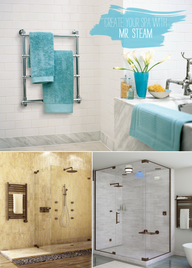
Last weekend I was reading an interesting article in one of Germany's biggest daily newspapers. The topic: The bathroom is advancing to a personal spa in a growing number of German households. Now I was very happy to see that the fab BlogTour sponsor Mr. Steam has great solutions for the design and wellbeing conscious consumer. And I do believe that this is a global trend. We are becoming more responsible consumers: we pay attention to our nutrition, to sustainability in design and to our health in general. So a private spa for the personal well-being is just another step to take. And Mr. Steam certainly has something to offer. 

The steam showers and towel warmers transform any bathroom into a modern hamam. If I had the opportunity to design my own home I would definitely pay due attention to the bathroom and create my very own spa.

Find Mr. Steam on Facebook and on Twitter. And they are available on the German market, too: Mr. Steam heats it up!

Photography via Mr. Steam 

Thursday, September 20, 2012

BoConcept Press Preview In Munich


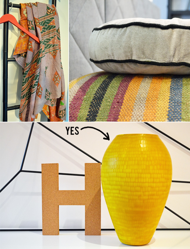
Last week I was invited to a great press preview of the 2013 collection by BoConcept. They organised a great press event in their Munich flagship store. But it was not only a mere collection presentation. It was way merrier: BoConcept is celebrating its 60th anniversary this year.


Founded 1952 as a carpenter's shop in Denmark, BoConcept has remarkably contributed to promote Danish design in the entire world and stands for refined and affordable Scandinavian furniture and home accessories. Already in the 50s, the Danish weaver Vibeke Klint provided some classy textile designs for the first pieces of furniture. The new 2013 collection revives some of these designs and showcases that good designs is truly timeless. 


Furthermore, the new collection features a great deal of functional and elegant designs. Classic and simple shapes and colours inspired by the 50s like petrol set the collection's tone. The home accessories line, however, features a broader colour palette with vibrant colours, graphic patterns, natural materials and hints of metal for an industrial charm. I've seen many things I really liked and could actually imagine in my home, too. Well, I snapped a few pics for you, of course of all those things I particularly liked. What do you think of these Danish goodies?

Photography by Igor Josifovic


Wednesday, September 19, 2012

5 Happy Inspirations: Happy Treats


Treat yourself. That's what I keep telling myself. I guess it is a sort of excuse for giving in when I spot something nice and new for my home. But sometimes I don't even have to buy something new. Sometimes I just have to dig into old things, to go through my mum's basement to discover some old and forsaken gems. That's what I did last weekend. Here is a little happy compilation of new & old treats that have one thing in common: the power to add happiness to a home!

1. Hand painted linen tablecloth from Shop Terrain. Oh yes!

2. The new collection by Rie Elise Larsen is just a happy feast! I love her cheerful paper designs.

3. My first piece of hand made ceramics. A bowl I made in school back in 1992. Happy memories!

4. I've stocked up on new washi tapes. I got these from my Swiss blogger friend Renate of Baumhausfee. Thank you my dear!

5. I heart these cushions as seen on Wendy Polish.

A hearty Wednesday, folks!

Tuesday, September 18, 2012

New Designs By Sian Elin Thomas


Welsh designer Sian Elin Thomas will be launching a new collection of textiles and wallpaper at this year's London Design Festival. Tent London will be the official launch of her new range including cushions, tea towels and wallpaper. Surface pattern designer Sian Elin Thomas has created a new range of wallpaper and textiles to mirror her fascination for the built environment.

Spending six months of the year in Israel, recent travels to India and throughout the Mediterranean are all reflected in her new collection. Influenced by the Islamic and Moorish architecture around her, Sian's designs feature bold hand-drawing and colourful detail. Sian is interested in how textiles and wallpaper can bring the outside world to the inside, and the way in which people interact with their interior and exterior environments.


This collection definitely has my 'happiness aproval'. Cheer up your home with Sian Elin Thomas!

Photography via Sian Elin Thomas

Monday, September 17, 2012

From Place to Space: A Little Greek Island


Here we are, a new week, a new Monday. I've spent a weekend with my family in Austria, helped my mother sorting out the basement, found some old, hidden treasures and there it was, my idea for today's blog post. An old, hidden treasure. A little voyage I did a few years ago. And it was then that I discovered a little, hidden Greek island. It is not so known among foreign tourists but rather popular with Athenians as it is not far away from the Greek capital yet so serene and divine that you feel like in the middle of the Aegean. I'm referring to the little island of Angistri. Welcome aboard!

I've dug out a few old snapshots to share with you. The great thing about these kind of islands is that you travel sort of blindfolded. We've entered the ship in Athens and arrived on this little island without any ideas or expectations. Nor any accommodation. But that is not too complicated. The main town is rather tiny and locals offer their rooms to any arriving guest in the little port. A few hotels, taverns and cafés line the main street along the coast and a beautiful and serene beach with clear blue waters is more than inviting. There are a few pathways to climb the hill behind the beach and a great tavern with amazing views of the bay awaits the diligent hiker. A simple Greek salad, some fresh seafood, a glass of chilled wine and a view of the Aegean - can I please order all that on this Monday morning? Happy week, friends!

Photography by Igor Josifovic


Saturday, September 15, 2012

Ideas For A Happy Weekend


Autumn is all around. It has gotten really fresh here in Germany and the nights are delightfully crisp and call for that extra blanket. Now if you like to celebrate a new season in your interiors too, you can choose to add a little seasonal decoration by creating an autumn inspired vignette. The pic above gives you one possible option. Think of muted, nature inspired hues and various textures. The above shown combination elegantly puts wood, metal, stone and glass into a decorative mix and freshens up the setting with a few fresh blooms. Weathered surfaces and rich textures speak of passing times and changing seasons. A few little things and here it is, an autumn inspired vignette. Happy weekend, folks!

Photography by Netta-Natalia for Lily


Friday, September 14, 2012

BlogTour Sponsor: Du Verre Hardware


My series of the fabulous BlogTour London sponsors continues! Let me kick-start this with a little question: What is very tactile, tangible, touchy-feely, design conscious and traveled the world? Ah no, it ain't me. I am speaking of one little but noteworthy detail in interior design: cabinet hardware. To be precise - Du Verre hardware. 

Du Verre not only is a leader in quality and original design for cabinet hardware, they also pay due respect to our environment. The die cast designs are made of eco-friendly recycled aluminum and add a green connotation to every kitchen design. While going through the information on Du Verre, I was amazed by the great deal of design consciousness. Du Verre collaborates with numerous award-winning designers and artists to create unique styles for every taste. The product palette is extraordinary and meets all kind of tastes - from traditional to modern hardware designs.

I have never paid attention to my cabinet hardware. But then again I realized that these bits are the ones we touch, tear, push and pull day in, day out. Have you ever paid attention to the tactile feel and the form that you grip while pulling your cabinet hardware? It is something I consider the unconscious sphere of design in every day life. And companies like Du Verre make it oh so noteworthy to consciously use and appreciate our cabinet hardware. 

Follow Du Verre on Twitter and like them on Facebook.

Photography: Kitchen via Remodelista; hardware via Du Verre


Thursday, September 13, 2012

A Stylish Reading Nook


Autumn is approaching swiftly here in Germany. And with it the need to cocoon and cuddle up at home. And it is the time to dig into those books that have been waiting on your shelves way too long. And to do so in style, here comes a little inspiration for a neutrally hued reading nook. I love the refined simplicity in this photo, the use of white, grey and wooden hues. And the idea of storing books in weathered crates is fab, too. Grab your favorite blanket, choose your book and make the best out of crisp autumn eves!

Photography via Finn

Wednesday, September 12, 2012

5 Happy Inspirations: Happiness!


Sometimes I am wondering if you, my dear readers, are sick and tired with my happiness obsession. This makes me happy, that makes me happy, and all of it makes my home happy. Are you rolling your eyes? But you know what: I am such an annoyingly happy person that I can't help myself. Not to mention my never ending obsession with beautiful home accessories. So I beg your pardon, but over again, here are '5 Happy Inspirations' that lift my elevated spirit even higher. I hope they'll add a bit of visual happiness to your Wednesday, too!

1. These softly hues blankets by Ferm Living are ideal to cuddle up during fresh autumn nights. Seen on Darling Clementine Shop. EXCLUSIVE FOR HAPPY INTERIOR BLOG READERS: If you like to order at Darling Clementine Shop, use the promo code happy123 for 15% off through September 30, 2012. They ship worldwide!! Yeah!

2. Doing the dishes is the dullest duty ever for me. The only way to add happiness: a cheery tea towel such as the 'Dot Dot Dot' one via Design Fuers Heim.

3. Pretty tableware is yet another soft spot of mine. These cups from Impressionen are such a perfect partner for an early morning.

4. The brand new prints of the 'Harvest' collection by Darling Clementine are beyond darling.

5. It's decided - I need some softly hues enamelware for my kitchen. Like this milk jug from Labour & Wait.

Happy hump day!

Tuesday, September 11, 2012

How About Some Fashion For Home?


Forget the New York Fashion Week. I am talking serious stuff here. Tangible stuff. I am talking about 'Fashion For Home'. Who wouldn't like a bit of fashion for the own dwelling, right? I added a stylish bit of fashion to my home with a new highlight - a brand new coffee table made of walnut wood with a refined white metal detail between the top and the table's legs. Now we talk prêt-à-porter!


'Fashion For Home' is an excellent resource for stylish and affordable furniture. When they approached me and asked me whether I'd like to present one of their pieces I was more than flattered. And the timing was just about perfect. My old Ikea coffee table has suffered seriously over the years leaving some irreversible scratch marks on its top and screaming for renewal. So here it is. The successor: the Copine coffee table by Sean Dix. And oh, I am in love with it!

So if you are looking for a new sofa, cool chairs, a stylish bed, colourful accessories or a coffee table too - 'Fashion For Home' has a great selection of designer furniture to very accessible prices and is available in the US, UK, the Netherlands, Austria and Germany. My verdict: happiness for homes approved!

Photography by Igor Josifovic


Related Posts Plugin for WordPress, Blogger...