Showing posts with label Color. Show all posts

Wednesday, February 11, 2015

Feeling Blue (Interiors)

The Every Girl

Design*Sponge

There is no easier question for me than the question regarding my favorite colour: It is blue. And in particular deep, rich and saturated hues of blue. I like to use indigo and other deep blue hues in decorating cause for me this creates a cosy and relaxed atmosphere to unwind and reboot my senses.
Urban Outfitters, 16House

Design*Sponge

Domino

One day I wish to own a deep blue and soft sofa, a deep blue wall, blue chairs. Oh I'll take a deep blue piece of art too. Not to mention my ever growing blue vintage ceramics collection - may it grow and grow!
Remodelista

Seventeenth & Irving

House of C

Temple & Webster

Photography by Igor Josifovic

Obviously, feeling blue is not that bad to me. At least interior wise. That's why my bedroom is covered in deep blue and grey hues (you can see more images in my post on Roombeez). What do you think about decorating with blue? Yay or nay?

Wednesday, January 14, 2015

Green Is The Hope!


Following up my last blog post I feel it is good to continue with a topic that will sketch my current emotional feeling that I want to transfer into my home, too - it is the invincible feeling of hope. In German there is a proverb saying 'Grün ist die Hoffnung' which literally means 'green is hope'. It stems from the dark medieval times when the sprouting green nature heralded spring time and hope germinated in people's hearts. Just like today my heart is filled with hope for a peaceful and great new year.

Green is a special colour when it comes to interiors - at least for me. I have hardly any green accessories apart from my growing urban jungle of course. However, I am always inspired when I see interiors with dashes of green - it is so fresh, vibrant and balancing to the eye. I wonder: Do I need to get myself something green for my home soon?


Green is not only the colour of hope but also the colour mostly associated with nature, youth, spring and envy in Western cultures. And it is the most important colour in Islam, found in the flags of many Islamic countries and representing the lush greens of paradise. Isn't this just wonderful? Green as a color of hope and paradise, in both, Western countries and the Islamic world? Maybe this could herald a better future for all of us. I hope so!

Tuesday, October 14, 2014

Why This Room Caught My Eye


If I tell you that blue is my favorite colour, I will not surprise you, right? No wonder then that this bedroom caught my eye in an instant. When I spotted the interior styling in this bedroom I was totally inspired - I immediately wanted new blue bedlinen and I wanted to redecorate my bedroom area. 

Blue is a wonderful hue for the bedroom - it is calming, soothing, it makes me think of the ocean, the sky, fresh, crisp air. It makes me want to linger on, to stay in bed and daydream. But before I digress, let me break it down why this room caught my eye:
  • Blue Bedlinen: I love these bedlinen! The deep blue colour, the playful Piñata inspired patterns, the softness of the cotton - I could literally jump into the bed if there wasn't my laptop screen in between us!
  • White Backdrop: Blue against white is magic - it recalls Greek island trips, nautical adventures, seaside holiday. Simple colour matching perfection!
  • Wooden Accents: Adding wooden accents to a blue scheme is wonderful. These colours complement each other and seem to translate the elements water and earth into interiors. Definitely something I will consider for one of my upcoming redecorating projects at home!
What catches your eye in this bedroom?

Photography via Hunting for George

Tuesday, September 23, 2014

Why This Room Caught My Eye

There are two ways of making a visual statement in interiors. Either you create an eclectic interior with lots of visual cues to draw the beholder's attention or you set a focal point by choosing one outstanding piece. In the above shown living room it is the blue sofa that stands out from a rather neutral surrounding. It immediately catches the eye and makes a real highlight performance in this stylish home. But it's not just the sofa that caught my eye. Let's break it down:
  • Blue Sofa: The most evident visual highlight is the comfy blue sofa with a touch of mid-century vibe.
  • Nature Hues: With the help of the blue sofa, the nature inspired hues come out to the beholder's attention - earthy colours perfectly frame this room and make an excellent stage for the blue sofa.
  • Natural Light: Nothing is more beautiful than the abundance of natural light in interiors. The large windows in this home make the entire living room light-flooded and welcoming.
What caught your eye? I bet it's the blue sofa above all, no?


Photography by Colin Price Photography, via The Everygirl 

Thursday, September 11, 2014

Interior Design Algebra: Pattern + Colour + Plant


Algebra is not as boring as it seems. It just depends on what kind of arithmetic items you choose. In my case I like to add, substract, multiply or divide with interior design and decoration elements. Today's equation is a very simple yet effective one: Add one unit of patterns to a nice unit of colour and add another item from the plant section and the result will be visual splendor. 

As simple as it gets, right? What is your personal interior design and decoration formula?

Photography via The Citizenry

Wednesday, August 6, 2014

Happy Interior Blog Recommends...


Here is a little thought I have from time to time while writing my Wednesday column: Is shopping a bad thing? More precisely: Do I have to feel guilty every time I buy a new little decor item or home accessories? Let me spit out the answer straight away without any further doubt: No! Ok, I would not want you to turn into an obsessive shopaholic who buys just for the sake of buying. But adding one or two little pieces for the home from time to time helps elevating your spirits and interior happiness. Trust me, I am a living test subject!

My little challenge every Wednesday is to not shop everything I recommend here myself. Believe me, I have often bought those things myself because if I gave in, I knew it's good enough to share with you all on the blog. So in last Wednesday's round-up of recommendations I bought one piece for example. This week I have resisted and haven't bought anything. Yet. How long will I remain strong? Who knows! Here are my 'coups de coeur' for this week:

1. Auva wallpaper by Trove
2. Ball Mason jar via Lieblingsglas
3. Isaac Sconce Brass by Schoolhouse Electric
4. Seagrass ceramic cup via Sugartrends
5. Blue enamel vintage teapot via Etsy

Happy hump day, friends!

Tuesday, July 22, 2014

Why This Room Caught My Eye


If I had to nail down one colour I love most, it would be blue. In all its shades. I don't know why, but it always makes me happy and definitely catches my eye. Like in this case - this summer house kitchen colour coded in a soft, summery blue is a sheer pleasure for my interior loving eye. The kitchen fronts, the splashback, the details - it all recalls warm summer days spent on the coast, a fresh sea breeze and loads of good and healthy food. But I digress. What caught my eye in detail? Here's the breakdown:
  • Blue Colour Coding: First and foremost, as mentioned, the blue colour coding in this kitchen is a real and instant eye-catcher. Using decorative and practical kitchen details in the same hue ties the entire setting together.
  • Wooden Details: Natural, raw wooden accessories perfectly blend with blue. Be it kitchen accessories like wooden cutting boards or wooden jars or bigger elements like a wooden worktop - the combination rocks!
  • Painted Kitchen Fronts: I can't tell for sure, but the kitchen fronts look almost like painted by their owner. And that's a great option for everyone who wants a fresh kitchen look without blowing the budget. A DIY to consider!
Does this kitchen catch your eye too?

Photography via Femina

Tuesday, July 15, 2014

Why This Room Caught My Eye


One thing is for sure: Let Emily Henderson design a space and I will be all drooling in front of my Macbook (sorry for this too visual wording). Same effect occurred when I stumbled over her Fig House Lounge project. Imagine a spacious lounge open to the outdoor space, think of mid-century vibes and colour pops wherever you turn. Think of visual happiness galore! In her blog post she documents the entire design process including a full before and after coverage. In the end I had a hard time picking one photo of this fantastic lounge, but let's give it a try and nail it down to three points that caught my eye:
  • Gallery Wall: Put a gallery wall somewhere and my attention is guaranteed. The vintage style gallery wall in this example is an instant eye-catcher - it adds a personal and artsy vibe to the lounge.
  • Colour Pops: The vibrant colour palette is breathtaking - mints, soft blue, pink, ochre, green - sometimes you have to be brave and stun everyone. But beware: This only works in a large space and with a unifying element or style that ties all colours together.
  • Mid-Century Console: The wooden mid-century console in the back is a fantastic visual anchor in this shot. It perfectly complements the furniture in this lounge and creates an almost intimate, private atmosphere in this lounge.
What do you think of this project by Emily Henderson?

Photography via Emily Henderson

Monday, June 16, 2014

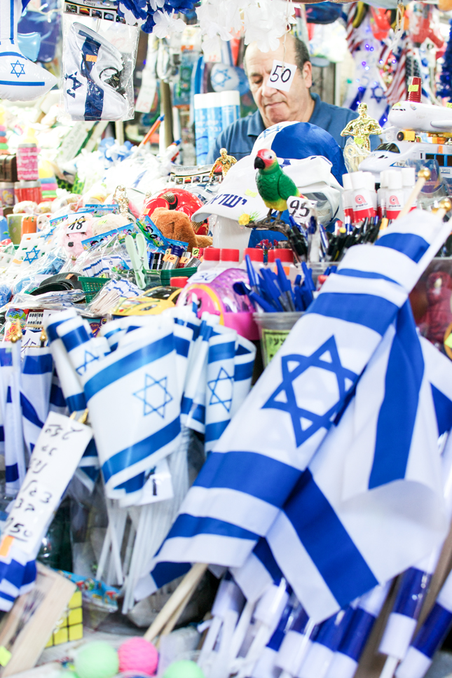
From Place To Space: Tel Aviv's Carmel Market


Lately I am stunned by the number of friends who have been to Israel over the past few weeks and months. I myself visited the beautiful country last month and showed you a few highlights from Tel Aviv, Jaffa and Jerusalem. I don't know if there is a major ad campaign from the Israeli tourism board or something else, but the popularity of Israel as a holiday destination seems to be booming. But I know one thing for sure: Nobody of my friends was disappointed. Neither was I - I enjoyed the country very much. So for today I thought I'll take you back to Tel Aviv and to its vibrant and lively heart - the Carmel Market.


Wherever I travel I love to visit the local market at least once. Originating from a country where people still buy their daily groceries at the farmers' market, I am drawn to the colorful, vibrant and bustling markets in the cities around the world. Tel Aviv's Carmel Market is in the city center and a typical example of a Mediterranean and Middle Eastern market. It has awning covered alleys to protect the sellers and shoppers from the burning sun as well as to keep the fresh produce in the shade. The offer of fresh fruits, vegetables, pastries, cheeses is abundant - and so are the various food stalls for a quick snack on-the-go.


I don't know why, but probably because I am used to similar markets in Serbia and Greece, I feel very comfortable among the buzzing crowds with yelling salespeople, with the touching and tasting, with all the scents and sounds that go with such an experience. Those markets are not meant to be picturesque tourist motives yet they are wonderful to be captured with a camera as they are utterly authentic and have that unique smack of local real life.


The Carmel Market is open every day except Saturdays and on Tuesdays and Fridays it has a special attraction - local artists sell their unique crafts, art and jewelry on the bordering Nahalat Binyamin Street. So whether you prefer fresh veggies, juicy fruits or local handicraft - the Carmel Market is not to be missed. But what you will get completely for free is a plentitude of inspiration, local lifestyle and the peculiar taste of Tel Aviv at a glance. Happy new week my friends!

Photography by Igor Josifovic

Wednesday, June 11, 2014

Happy Interior Blog Recommends: Intimacy Under The Wires By Sivan Askayo


Last month, during my trip to Israel, I had the pleasure of meeting my friend and travel photographer Sivan Askayo in Tel Aviv for a dinner (see us HERE). I was pretty lucky taking into consideration that Sivan is an avid traveler - mostly for her work she travels the world on a constant basis. And as a passionate traveler and restless inspiration hunter myself, both Sivan and I have a solid basis for our friendship. 

During our dinner she told me about a project she hs worked on since 2010 and was now ready to launch. A project with a pretty alluring and intriguing name: Intimacy under the wires. I was curious to hear more about it and so she showed a few of her photos which are now part of her limited edition sold on Artfully Walls


I loved the idea that Sivan found inspiration in something rather mundane, especially in cities in the south. Hanging laundry above streets is not so common here in Germany, but very normal in many warmer countries. And it was her domestic ground that set the tone for a series born out of her ongoing inspiration hunt: she snapped the first pics in Tel Aviv's Jaffa neighborhood and continued this series on various other trips to cities like Barcelona, Naples, Florence, Buenos Aires and many more. Whereas hanging laundry seems to be utterly mundane, it carries so much more for the curious observer: it tells an intimate story about its owners and ignites interpretations about the people wearing and using the exposed laundry. 

Ten of her exclusive snapshots of the 'Intimacy under the wires' series can now be bought over on Artfully Walls

Happy hump day!


Photography by Sivan Askayo

Tuesday, May 27, 2014

Why This Room Caught My Eye


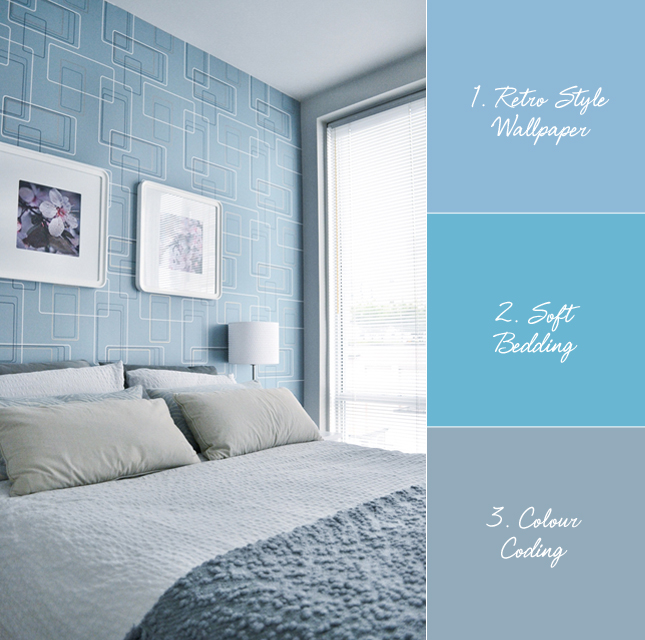
Whenever I get asked to describe my interior style, I use expressions like 'Scandinavian inspired', 'ethnic elements', 'colour pops'. I think I have never used the word 'retro' to describe my own style. Of course the reason is: My personal interior style is not retro at all. But I've noticed one phenomenon, especially on Pinterest: I also like interiors that represent a style that I wouldn't want to live in constantly. Maybe that's what retro means to me in interiors. Anyways, this intro aims at today's room that caught my eye: a very retro inspired bedroom.

In fact, I've slept in that bed for quite a few nights last year when I went to Vancouver, Canada. It is a very retro inspired airbnb apartment in a historic building in downtown Vancouver. The dominating colour was a petrol hue with blue and earthy hues, giving the entire apartment a sort of quirky 60s vibe. You can see the whole tour of the apartment in my guest post on Roombeez. The bedroom caught my eye in particular as I was fascinated by the spacey wallpaper design and the blue hues. But let me put it in bullet points:
  • Retro Style Wallpaper: The wallpaper is an instant eye-catcher. It has the perfect grayish blue colour to suit the rest of the room and the pattern is sort of delirious - pretty fun!
  • Soft Bedding: Something I appreciate in North America - the bedding is always super soft and comfy. Here too, a great mix of textiles create a multi-tactile feeling and super soft sleeping base.
  • Colour Coding: The interior design is carried out with utmost care. It is reduced but the shapes, colours and materials are well coordinated - the quickest eye-catcher being the blue colour coding in this bedroom.
Are you a retro person? Or is it too crazy for you?

Photography by Igor Josifovic

Tuesday, April 22, 2014

Why This Room Caught My Eye


Orange is a colour I always put on the side of more 'challenging' interior design and styling thoughts. Why? Because I am very suspicious of orange as a colour in interiors. It seems to be too flashy, too dominant and too individual in its first sight appearance. I found it always difficult to fit in my own interiors but then I was challenged to tackle the colour with a new vase (I blogged about it HERE) and after doing some Pinterest research I must admit that orange is an absolutely legitimate colour in interior design.

Orange should be carefully considered and used adequately. This example of a living room with orange elements is a great proof for that: Combined with similar warm hues from the same colour family and placed in a neutral background it comes to its full and beautiful force. But let me put it in three simple points:
  • Orange & Warm Hues: The use of warm hues of the same colour family with a clear dominance of orange makes this room very bright and inviting. It looks cosy and uplifting - a place where you can see yourself unwind as well as have inspiring conversations with friends.
  • Ethnic Patterns: Ethnic patterns seem to be a great friend of vibrant colours. The rug on the floor and wall as well as the pillows make for a perfect stage to showcase the colours in this room.
  • Black Cabinet: The wooden black cabinet is a strong visual counterpart to the vibrant hues. It calms the entire room, sets a focal point and ties in with the remaining furniture - if it was another colour the room could quickly turn into a restless visual chaos.
What do you think of orange? Is it a colour you can handle in your interiors?


Photography via Norrgavel

Tuesday, April 15, 2014

Why This Room Caught My Eye


Imagine this: Gathering in the kitchen with your family and friends around a big table, serving homemade food, chatting and laughing along. Real happiness seems to include very often the people you love (of course) and good food. And I totally agree with that. Well ok, I would add that a beautiful kitchen and dining area will enhance that happiness of course as I take quite some pleasure in well designed interiors. This kitchen and dining are are a great example of a happy space. Warmth and cosiness with wood and colours evoke an inviting ambiance for happy gatherings. But let me put it in three bullet points:
  • Blue Industrial Pendants: These large industrial pendants in a dusky blue hue are a visual highlight for me. Paired together they really have visual impact and tie together the colour scheme of the entire kitchen design.
  • Mix & Match Chairs: The playfulness of a mix & match approach when it comes to chairs is a winning factor. Various designs and colours mixed together result in a vibrant and interesting effect. 
  • Wood: Hardly any other material has so much warmth and character like wood does. This kitchen is defined by wooden structures and surfaces - from the ceiling over the kitchen fronts to the furniture - definitely a kitchen I would like to cook and dine with family and friends.
Would this kitchen and dining area catch your eye too?

Photography via 101 Woonideeën

Friday, April 4, 2014

Ceramic Art London: L'Atelier Des Garcons


Friday is such a cool day. It is the start of the weekend and this Friday is even more special as I am currently in England attending a fantastic styling and photography workshop on a beautiful farm. But more about this soon on the blog. What I am equally excited about is my London weekend. The timing could not have been better!

This weekend the Ceramic Art London 2014 is taking place at the Royal College of Art where contemporary ceramics will be exhibited. I have grown a strong interest in ceramics over the past few months, especially those handmade pieces like my friend and blogger Gudy Herder started producing. 

I was smitten when I saw that one of my favorite French ceramic studios 'L'Atelier des Garcons' will be exhibiting in London too. Their ceramic designs are so happy and colourful - fun patterns, bright colours and cute, slightly irregular shapes - everything I really love! I can't wait to see them in real life and (hopefully) touch them. I hope to get the chance to speak to the designer Éric Hibelot, too. 

If you want to join me during the styling workshop and my London adventures including the Ceramic Art exhibit as well as some cool stores like WestElm, make sure you follow me along on Instagram.

Up to then: Have a fabulous weekend, friends!

Photography via L'Atelier des Garcons


Related Posts Plugin for WordPress, Blogger...