Thursday, January 31, 2013

For Your Next Party: Pantone Mood Food Set


One day I got home from a weekend abroad and I found a little package in front of my door. Being an diehard online shopper, I immediately tried to remember what I've ordered. When I opened the package I realized it was something else - it was a beautiful set of melamine food trays by Pantone that was sent to me from Room Copenhagen. The set consists of eleven trays in different sizes and is ideal for sushi, tapas, sweets and any other kind of tidbits. 

Pantone's 'Mood Food' set is said to be for colourful dining. An idea I really like! Colour is life. Live it. That's written on the packaging and I appreciate Pantone's outreach in all spheres of our lives to add colour and - as I would say - a bit of happiness to the mundane. Room Copenhagen was kind enough to send one set to my little happy home and I was very keen to immediately use it. The set is offered in various colours. I've picked a dark blue hue called 'Indian Teal' cause it's a great backdrop for colourful food. With this cool set I feel like I'm ready for the next party. Now I just need time to organise one.

I didn't have any sushi at hand, but I think the food trays are perfectly suitable to serve fruits and sweets as well. I've used some fresh plums and figs, traditional French 'Calissons à la violette' and organic gummi bears. Very classy, right? What do you think of the 'Mood Food Set' by Pantone? 

Photography by Igor Josifovic / This post was kindly sponsored by Room Copenhagen

Wednesday, January 30, 2013

5 Happy Inspirations: Human Empire Shop


My Wednesday happy picks tend to come from various sources. But lately I am absolutely smitten by cute online shops which sell a variety of goodies for happy homes. So today again I've decided to select '5 Happy Inspirations' from one online store called Human Empire Shop. The shop is located in Hamburg, Germany, and is shipping worldwide. The great fact is that Human Empire Shop constantly adds new goods to its range and has an exclusive design range with funky paper goods, posters, T-shirts, bags. Well, here are my five happy picks for this Wednesday. Happy hump day, friends!


Photography via Human Empire Shop


Tuesday, January 29, 2013

Why This Room Caught My Eye


I truly believe in the notion that colour equals happiness. Now some of you who are devotees of the monochromatic approach in interior design might disagree with me here, but hey, this is a place to go crazy and berserk when it comes to homes. So today's room that caught my eye is a perfect example of a real colour explosion. Here are the three reasons that made my jaw drop:
  • Eclectic colour mix: I know it's not for everyone, but this eclectic colour mix just made my eye go all over this room. The funky art, the two bright Stool 60 examples by Alvar Aalto, the multi-coloured and multi-patterned home textiles - all comes together into a happy room.
  • Dark walls: In order to make all the strong colours pop, the owner has decided to go dark with the walls. An excellent backdrop for all the brights!
  • Bright yellow sofa: The yellow sofa serves as a sort of visual anchor in this room. It draws the eye and sets the tone for all the other colours and patterns. 
More of this colourful apartment can be found here. What do you think of this room? Cool and funky or way too colourful and chaotic? I'm curious to know your opinion!

Photography by Trevor Tondro for The New York Times

Monday, January 28, 2013

From Place To Space: Patisserie Colorova, Paris


Here is another post for you folks who plan to travel to Paris soon. And for all of you, who can't travel to Paris anytime soon. I am taking you to a very cool and pretty new patisserie on the left bank of Paris. In the vibrant sixth arrondissement you will encounter a new type of patisserie. It is unlike the traditional Parisian patisseries: it is cool, it is designy and very inviting for leisurely spent hours. But Colorova is way more than just a patisserie. You can enjoy the artfully prepared sweet treats by chef Guillaume Gil, but you can also enjoy a fine lunch during the week, tea in the afternoon and sweet and savory brunch on the weekends.


The food and the service are impeccable. But this is Happy Interior Blog and I can't help but talk about the ravishing interior design.It starts with the big glass front that elicits views from passengers into the open space with wooden furniture. The counter is very cool and reminds me of the game Jenga, the lighting is spacey above the counter and industrial in the other corners. The retro Smeg fridge in pale turquoise sets a colour accents as do the fabulous armchairs with vibrant upholstery made of Tunisian woven textiles. An indoor window opens the view into the kitchen slash food lab while the backwall is wallpapered with a bold geometric pattern and colourful art ties the whole visual concept together.


With other words: Colorova is a treat for your palatine and design-loving eye. You can find Colorova on Facebook and in Paris at the address Rue de l'Abbé-Grégoire 47 in the sixth arrondissement. Enjoy and happy Monday!

Photography by Igor Josifovic

Saturday, January 26, 2013

Ideas For A Happy Weekend


It's 1:45 a.m. as I am typing this words onto my blog and fill my mind with weekend thoughts. And my central thoughts are circling around the word bed. Why? Because I am pretty tired of a long week with very late nights, early mornings, work, writing, running errands. Sometimes I feel like I want to do so many things during the weekend, like getting up early, going to the bakery for fresh croissants, buying flowers at the market, going to my favorite organic supermarket for food. Then I always want to shoot a few photos during daylight as well (it's impossible during the week due to my day job). 

But then I am so beat that I really just want to stay in bed, sleep in, have a lazy breakfast, stay half of the day in my pajamas and watch the world go by through the window. But what I really like about weekends is that they are pretty much unpredictable. So after all, I don't know how my weekend will be and what I'll do. I will just try to make it a great and happy one. Which is exactly what I wish you, too!

Photography by Nicolas Mathéus for Marie Claire Maison

Friday, January 25, 2013

Happily Ever After: Atelier Stella


Ceramicists are real artists. They take a piece of clay, work with their hands and magically transform the bulky piece of raw material into art pieces. Gems that we love to expose in our homes and gardens. The miraculous combination of nature, human power and workmanship are the key ingredients to an art so worldly yet perfectly divine. The British artist Stella Baggott is one of those persons, whose hands magically metamorphose earth into art. 


Her collection of unique and handmade ceramics has a big happiness factor. The cheery little faces on her art pieces seem to recall memories of archaic pottery with the happy twist of a witty and contemporary design. Her vases, plant pots, plates, bells are incredibly cute and extraordinary eye-catchers. 

Now if you are like me you immediately want to know if these cuties can be bought anywhere. Good news is: yes, Stella has an Etsy shop. But there is a but. She's sold out (no wonder!) so her Etsy shop is currently closed. Yet better news: It will reopen mid February with a new collection of happy ceramics from the Atelier Stella. My finger is ready to hit the order button! Happy Friday, friends!

Photography via Atelier Stella

Thursday, January 24, 2013

Design Love Discoveries: Maison & Objet 2013


Last weekend I did't go to Paris to only enjoy the snow. The main reason was the Maison & Objet design fair. After noticing the new interior design trends for 2013 at the imm Cologne one week earlier, I headed off to the French capital to discover new designs and new brands. If someone asked me to summarize my impressions from the Maison & Objet in a few words, I'd say: color and individuality are to shape our homes in 2013!


One of my absolute highlights from Paris was the discovery of the brand new French design label 'Singularité'. The creative trio Marie Dessuant, Julie Arrivé and Emilie Cazin surprise with an airy playfulness and color details in pastel hues. The smart 'bench goes sofa' as well as the 'Etagère Y' called shelf unit confirm the overall trend of pastel hues and flexible furniture for individual homes.


The Danish design evergreen HAY knocked me off my feet with its super cool and modular system called 'New Order'. The collection is still a prototype and will not hit the stores before late autumn 2013. Various units can be combined, colors and materials can be exchanged and thus every customer can literally design his individual piece of furniture. Maximum individuality for the homes of the future! 


I particularly loved to discover French designers at the Maison & Objet. So when I met Isabelle Gilles, the creative mind behind the label Colonel, I could personally express my admiration for her happy lighting designs. Here again, pastely hues dominated the new collection and crooked lampshades seemed to be the ideal dose of quirk for a happy home!


My soft spot for home textiles came to the point of melting when I discovered the stand of the Danish brand Lucky Boy Sunday. The designer Camilla Kørschen introduced me to the new summer 2013 collection and explained the inspiration coming from the world of children and adults, the everyday and the unusual, with a poetic and artistic sensuality. To completely understand this notion, you have to touch their knitted cushions, blankets and toys. These were the softest knitted textiles I have ever felt and the patterns and colors are absolutely adorable. I so want these for my home!

Case Furniture was yet another highlight that draw my attention with the great use of wood, glass and colorful elements. Cabinets, sideboards, tables, chairs and more make part of their sophisticated collection for stylish yet witty homes. 2013 is the year of colors and natural materials, so opt for wooden statement pieces with colorful details.

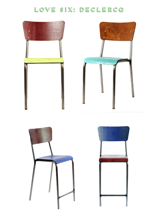
Retro school chairs with a new twist - this was the focus at the stand of Belgian design label Declercq. The retro chairs were reinterpreted with colorful leather upholstery and are best set in scene with a mix & match approach for a cool, urban kitchen. Here again, soft hues confirm the overall pastel trend for 2013. 

After a long day at the Maison & Objet fair I was utterly tired and completely happy. I love to discover new brands, experience brand new collections and speak to the designers behind the products. Maison & Objet, I will be back in 2014!

Photography by Igor Josifovic and named brands

Wednesday, January 23, 2013

5 Happy Inspirations: Der Kleine Bazar


Today I would like to introduce a little German shop (in the little south German town of Augsburg) and webshop to you. 'Der Kleine Bazar', literally 'The Little Bazaar', offers charming home accessories, little furniture pieces, lighting and textiles from the Middle East and Northern Africa. The two shop owners, Johanna and Axel, pay attention to locally handcrafted items, a sustainable production and fair conditions. Hence, you're not only shopping beautiful home decor, but you shop with a good conscience, too. Here are my five happy picks from this charming little boutique:


I want them all. Period. And you?

Happy Wednesday!

Photography via Der Kleine Bazar

Tuesday, January 22, 2013

Why This Room Caught My Eye


Tuesday candy for our interior design loving eyes - that's the purpose of my Tuesday series 'Why This Room Caught My Eye'. I was going through the various issues of my favorite Australian e-mag Est Magazine and got hooked by this dining nook. Here are the three reasons why this room caught my eye:
  • Signature lighting: The industrial style, oversized wall lighting sets the tone in this dining nook. In combination with the tiled wall this lighting calls for a reduced, rather monochrome styling.
  • Black & Wood Dining: The set of dining table and chairs in black with a wooden tabletop are the ideal counterparts for the lighting. I like the café style chairs as opposed to the raw metal table base.
  • Floating storage: A little dose of quirk adds the perfect pinch of interest to this nook. The slightly irregular order as well as the use of dark blue shelves loosen up the raw industrial touch.
Anything you like in this room? Tell me!

Happy Tuesday!

Photography via Est Magazine

Monday, January 21, 2013

From Place To Space: Paris Winter Wonderland


Hello my friends! What a busy week it's been! After the great trip to the imm Cologne with lots of design inspiration and blogger meet-ups, I headed last Friday to Paris to chase more interior design inspiration at the Maison & Objet (more on this later this week). Moreover, I had the big pleasure to experience Paris as an enchanting winter wonderland: Paris experienced the heaviest snowfalls in years the past weekend!

Most of you know that I spent Christmas and New Year's in Paris too so I've decided to compile a mix of highlight pics to showcase the difference of Paris - with and without snow. Experiencing Paris with a lot of snow is simply magical - I was literally walking around with a big smile on my face. I just couldn't help it. On every corner there were jolly kids making snowmen and having snowball fights, people taking pictures everywhere and the parks were absolutely full with kids sledging, people walking under the snow, I even saw guys skiing and snowboarding in the park Buttes Chaumont! I love this city!


As this post is a sort of second part of last Monday's Paris report, I will share again some of my highlights from the last two Paris trips. So if you happen to be in the City of Light anytime soon, make sure to check these out:

Voilà! I hope you enjoyed my little virtual tour through Paris and I hope to welcome you again on my blog tomorrow!

Photography by Igor Josifovic

Saturday, January 19, 2013

Ideas For A Happy Weekend


Here is my weekend post - written from Paris! Yes, once again I am here, in the 'City of Light'. I just came over the weekend to visit the design show Maison & Objet - so expect soon some more interior design trends, this time from Paris. In the meantime, I am waiting for spring. The last few days it was snowing like crazy in Munich. I always catch myself how I set my senses to spring as of mid January onwards. And then the big snowfalls of the past days come as a sort of bummer, but hey, there is always a little home decor twist to add a touch of spring, right? I bought a little hyacinth so now I not only wait for spring but for my hyacinth to bloom, too. Maybe then the sun will come out and it will get milder? Who knows. 

Oh and one more thing: This week I was interviewed by the German national TV channel WDR about why design makes me happy. Here is my little interview for those of you who understand German and a few snaps of my home published by WDR.

Happy weekend, my friends!

Photography by Igor Josifovic


Friday, January 18, 2013

Blogsalon Tour At The Design Fair


This week is full of design and interior inspiration. I am back from Cologne, I unpacked and now I am packing my suitcase for the next interior design show - this time I will be off to Paris to visit the Maison & Objet show. But before I head over to my favorite city, let me get back with inspiration from Cologne to you.

As part of the new German lifestyle blogger network Blogsalon I was invited to visit a few companies and discover their design news. Let me give you a little tour:

For the cool city boy: Fatboy
The iconic Dutch producer of bean bags, Fatboy, showcased its new colourful range with hues like yellow, grass green and petrol. Moreover, I was surprised to discover a whole range of products beyond bean bags - rugs, indoor cushions with ethnic patterns, lamps, pendants - all with the unique sense of quirkiness and fun. My favorite were the indoor cushions in vibrant reds and kilim inspired patterns.

For the nature loving boy: Team 7
Yesterday I already wrote about this Austrian company that impressed me pretty much. Being a born Austrian myself, I was absolutely smitten by the refined wooden furniture of Team 7. Solid wood is the key material in their collection, sometimes paired with glass and leather for a sophisticated twist. My favorite was the smart and extendable dining table Flaye with a patent-registered extension mechanism. You can literally extend the table with one hand!

For the playful individual boy: Lago
The Italian home brand Lago was a real revelation to me. They are just about to enter the German market with a interesting and holistic concept offering highly modular elements for a stylish home. They offer furniture, wallpaper, rugs, bathroom sinks, kitchens. I was stunned to see the wide yet super smart range. I was particularly drawn to the floating Wildwood bed and the romantic wallpaper Luci e Ombre - it creates a faux window shadow on your wall. Dreamy!

For the dapper boy: Grohe & Kaldewei
To round things up, I headed over to the mutual stand of German bathroom brands Grohe and Kaldewei. They presented a lush spa area with big tubs by Kaldewei, amazing rain showers and sleek faucets by Grohe. Their concept envisaged a new, private spa area for the home. Well, I kept dreaming of such a luxurious treat for my shoebox apartment, but one day, one day I must go for the full spa experience. And then I will definitely get back to these two brands!

Happy Friday, friends!

Photography by Igor Josifovic. This post is kindly sponsored by the named companies.

Thursday, January 17, 2013

Interior Trends 2013 from the imm Design Fair


This week is a real design marathon. I am just back from the imm Cologne where I spent two days full of blogger fun and design inspiration. However, two days were just not enough: the first day was reserved for a bloggers lunch that I organized for Siemens Home Germany, then I attended the blogger panel 'We are Social' (see round-up here) and later on I continued with a few of my fellow bloggers to the Future Living Award ceremony hosted by Siemens Home Germany and Architectural Digest.

It was not before the second day that I had the opportunity to roam the design fair on the search for trend indicators in interior design. Here is what I got out of it and took with me as trending at the imm Cologne:

1. Trend: Pastel Hues
Pastel hues have been a big trend in 2012 already. However, this trend seems to continue all the way into 2013 if it is to judge according to what I saw at the imm Cologne. Many stands showcased a plethora of pastely furniture, home accessories and home textiles. I particularly loved the smart furniture system ADD by Werner Aisslinger, designed for the German company Flötotto. It is a modular concept based around changing modern requirements. Highly individual and lovely pastely!

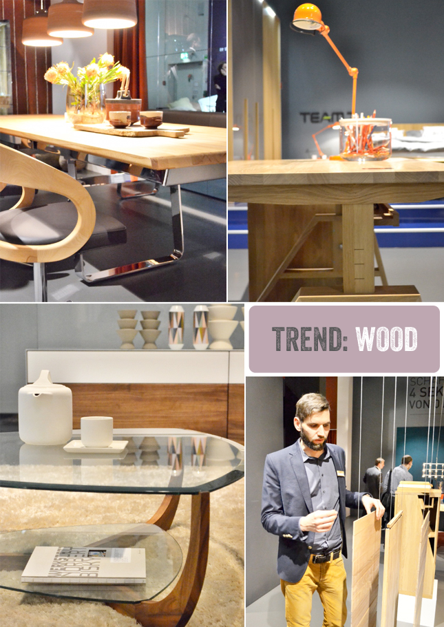
2. Trend: Wood
I was very pleased to see a growing importance of natural material in furniture design, notably wood. As an Austrian I was very happy to visit the stand of the Austrian furniture manufacturer Team 7 - their motto is: It's a tree story. I spoke to their designer Jacob Strobel (see above, the young and super creative mind who learnt to be a carpenter) who explained his inspiration and work ethics. He told me that he loves to showcase smart cuts, edges and surfaces of the wood and prefers to hide the super smart tech (e.g.  automatic extension mechanism for dining tables). I was very impressed with the great furniture range and the variations of wood.

3. Trend: Candy Colors
My color loving heart beat faster when I came across the stand of the home textiles producer Nya Nordiska. Candy colors galore - stripes, rhombus shapes, triangles, zigzags - the shapes were as varied as the colors. Even at other stands with dominating pastel hues, I could always spot a range in bright, bold colors such as at the Muuto stand. A trend I love and will cherish in 2013!

4. Trend: Geometric Shapes
On headboards, as lamps, as coffee table surfaces, on textiles, as decorative elements - geometric shapes continue their success story from 2012 into this year. This is yet another trend I love - I like to add a touch of geometric shapes on home textiles and illustrations in my home.

5. Trend: Copper
Towards the end of 2012 it was very evident - copper was trending. Especially with home decorations and lighting. The longevity of metal and the warm hue of copper, matt or shiny, has found its place in stylish homes. This time copper has also entered into furniture design as an element or dominating material for tables, chairs, sofa frames. Like!

Do you like one of these trends? Let me know in the comment section!

Photography by Igor Josifovic, Muuto chairs by Clara Kirchner


Related Posts Plugin for WordPress, Blogger...