Showing posts with label Grey. Show all posts

Tuesday, February 11, 2014

Why This Room Caught My Eye


Today I was shuffling things around in my home. I moved books, stacked them differently, added a few books to my windowsill, changed the placement of vases. After all the commotion I finally sighed and said: oh, well. Everything felt ok but not perfect. But on the second glance I realized that the perfection lies in the imperfection. In that little aspect that makes our home look real. Lived in. Not like an over styled home tour in a glossy interiors magazine. Do you know what I mean?

Even today's eye-catching room seems to be in this category of a warm, lived-in home. What exactly caught my eye? Here we go:
  • Grey & Blue Scheme: Oh yes, my kind of colour scheme here. I love grey and blue hues in combination. I mean, that is how my home looks like too - with a dash of yellow injected for visual happiness. Here the colour combination creates a perfectly comfy and serene atmosphere.
  • Home Plants: Here he comes again, the 'Urban Jungle Blogger' in me - show me some home plants and I'm all smiling. The cacti/succulents on the windowsill and the fig tree in front - just the right addition to this lovely room.
  • Various Patterns & Textures: The equation here is classic in interior design: calm and neutral walls, rug and sofa create the best stage for a plethora of patterns and textures to add interest to a room. Play with cushion sizes, shapes and patterns, throw in a variety of textures like the sheepskin in the front, and the visual impact is spot on. 
How do you like this living room?

Photography via Stadshem

Tuesday, November 26, 2013

Why This Room Caught My Eye


The very moment I type this words on my MacBook, it's snowing outside. It is the first snow of the year here in Munich downtown and I am a bit excited. The first snow coincides with today's opening of all Christmas markets around town so I can surely say: Winter has arrived and Munich is getting festive! With the first snowflakes I am getting into a sort of hibernation mood. Layering various textiles, taking that extra blanket for your bed, adding a few more cushions to the sofa, adding muted colours to the scheme - the more frosty it gets outside, the cozier it gets inside!

When I spotted this bedroom on Pinterest, I felt like it perfectly conveys that winter cosiness I have mind. It caught my eye instantly and I could happily jump into the bed, snuggle up with a cup of tea and a good book and forget about time, weekday, to-dos or the cold winter day outside. 

What exactly caught my eye? Here are interior styling eye-catchers:
  • Grey Symphony: I have a soft spot for grey hues. I think grey is a fabulous, calming backdrop for a cosy feeling at home. Whether it's just one feature wall, the entire room or a combination of wall, home textiles, home décor - the effect is cosy yet sophisticated. Just like in this bedroom.
  • Muted Colours: The use of muted colours in this room perfectly blend in with the grey backdrop. The soft shades of green, purple and brown give the room a rooted, earthy base as opposed to the elusive lightness of grey.
  • Ethnic Elements: Another soft spot of mine - everything with ethnic patterns catches my eye immediately. The kilim rug and cushion tie the whole interior styling impeccably together. 
Does this room catch you eye?

Photography via Klikk Bolig by Solveig Grovle and Ann Helen Lund/NIB

Tuesday, September 10, 2013

Why This Room Caught My Eye


Two days ago I met up with my Parisian friends here in Berlin. Yup, I am still in the German capital where I am working. So when we met up I had to go with them to their airbnb home and was totally stunned to see a fabulously big, loft-like home shared by seven people that was one entire MESS. A huge mess. The kind of terrible mess. 

Anyways, my friend Cécile was joking and saying I should take pictures and describe why that room caught my eye. Pure mockery LOL. Instead of shocking you with a 'Berlin loft gone wrong', I rather share a wonderful corner of this Stockholm home with you. And here is why it caught my eye:
  • Industrial / Rustic coffee table: The combination of weathered wooden tabletop and raw iron cast base is a fabulous combination that seems to unite two styles - industrial and rustic charms. 
  • Fluffy, patterned rug: This rug with its simple pattern reminds me of a Boucherouite rug - maybe it is one.
  • Soft colour palette: The palette of whites, blues and greys with pops of black is winning my eye. I really love this kind of soft colour palette right now!
Is this little corner inspiring you? What do you like or dislike about it?

Photography via Svenska Mäklarhuset


Friday, August 23, 2013

New Milk Lamp & Colour Crush


It is past midnight while I am typing this words and I am unnaturally late with my blogpost writing today. But the reason was quite fancy - I organized a little blogger meet-up for the local Munich blogger community and we had a great evening with food and drinks. So, this intro was necessary as I had two glasses of chilled rosé and hope to be clear and comprehensible in today's post:-) On this happy Friday I chose to share with you a new cutie that  has moved into my apartment: the fabulous 'Milk Lamp' designed by Norm Architects and manufactured and sold by &tradition.


I am in love with this lamp because it is simple and sophisticated at the same time. It is a well designed table lamp that carries the essence of Nordic design in its DNA. The simple lines, the combination of natural materials such as wood in combination with glass, the warmth of its light - all this makes this lamp a design masterpiece. I particularly love the dimmer as you can adjust the light and atmosphere according to your wishes.


I have placed my new Milk Lamp on the sideboard in my bedroom and have created a little vignette around it featuring my current colour crush - blue and grey. I love the two colours in combination and I've added two small ceramic houses by Bloomingville, a vase by House Doctor with some coloured ribbon in it and a lovely watercolour painting by Greek artist Fiona Zakka

I am pretty happy with this vignette. What do you think? Do you like it? What about the Milk Lamp?

Photography by Igor Josifovic


Tuesday, August 20, 2013

Why This Room Caught My Eye


It's time for some Tuesday interior candy my friends! Today's choice is largely influenced by currently two projects that I am working at: my own living room redo (yep, I mentioned that a few times already) and an exciting styling project for the upcoming DesignTrade show in Copenhagen. My major inspiration is a colour combination: blue and grey. That combined with a variety of textures and natural materials is the look I am aiming at currently. And when I spotted this room, my eye got caught by these elements:
  • Blue colour accent: The 'Dot Cushion' from Hay in light blue is a wonderful, almost icy refreshment in this living room setting.
  • Black & white elements: Black and while elements in accessories complement the serene blue and grey colour combination perfectly.
  • Grey backdrop: The grey sofa functions as a perfect anchor and backdrop for the entire setting here by creating a serene yet strikingly stylish interior. 
What do you think of my current interior design craving? Love or loathe?

Photography via Ved Siden Av

Friday, July 26, 2013

Happily Ever After: Photographer Sivan Askayo


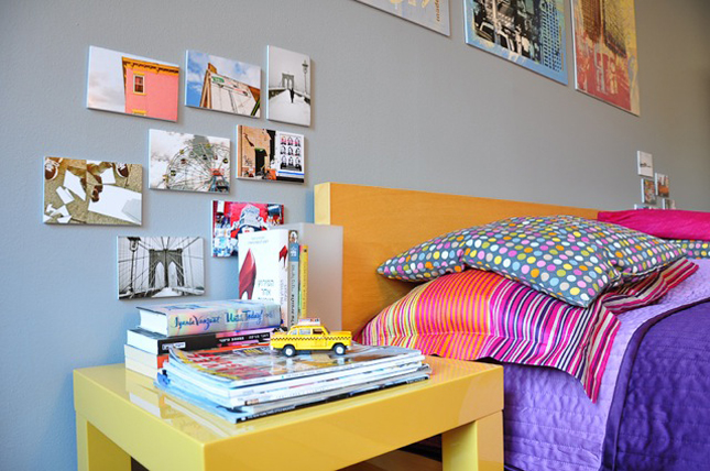
A few days ago I chatted with Sivan Askayo on Twitter and Facebook. We talked about the colour grey and its use in interior design, its excellent feature as a backdrop for other colours, and eventually I told Sivan that I am planning on painting a few feature walls in two grey hues in my home. That is when Sivan told me about her 'happily designed' bedroom with a grey wall and sent me a few snapshots. Yesterday I got my walls painted (what a chaos in my small apartment) and I thought it's a good starting point to share Sivan's pictures here before I prepare my own home story.


Sivan Askayo is an Israeli travel photographer and writer currently based in New York City but soon to  head off to Tel Aviv. I admire her work and loved seeing her collaborate with Sister Magazine. Actually, when I went through her portfolio on her website I wondered what it must be like to be a travel photographer and writer - I mean imagine, your job would be to travel the world, discover the beauties around the globe and report them in words and pictures? I wonder: Is it too late to become a travel photographer?

Happy Friday, friends!

Photography by Sivan Askayo


Tuesday, June 26, 2012

Colour Combination: Grey & Pink


Recently I have been thinking about a very specific hue, a colour that polarises. Pink. While some are all for it, others are - gently put - rather reluctant. I was never head over heels into pink, but lately I was coveting a special combination: pink and grey. If I had to narrow it down more precisely, I would say dusky pink with an anthracite hue. In order to give you an idea what I have in mind, I've put a little collage together for you. Plus a few market finds to bring that style into your homes. Hope you enjoy!


Photography: Living room via Style Essentials; Subway map via Söderbergagentur; Letter via La Maison d'Anna G.; balloons via We Heart It; Bedroom via Est Magazine; Pendant via Etsy; Eames DSW chair via Vitra; Cushion via Fine Little Day; Vase via Etsy; Candleholder via French Connection; Bedcover via H&M Home.
Related Posts Plugin for WordPress, Blogger...