Tuesday, April 30, 2013

Why This Room Caught My Eye


Ready for some Tuesday interior candy? In good tradition, here is a room that absolutely caught my eye this week for - I'd say - obvious reasons. This is such a wonderful example to showcase the vast power of colours in interior design. This composition is like a painting - every hue seems carefully chosen, every placement thoughtfully arranged. Don't get me wrong, I truly believe that a monochrome interior can expel a similar visual power - but here we talk colour, right? But let me point out the three points that caught my eye in particular:
  • Colour Coding: The commitment to a precise colour palette does the trick here. A white setting as an ideal background make the warm orange and yellow pop to the max. The warm yellow is perfectly enhanced by the saturated tangerine and the colours reflect not only the larger pieces but also the decorative details.
  • Happy Shelves: I love this kind of open shelves in such a happy colour. First of all, they just look so decorative and secondly you can display your favorite magazines, books, prints and change the little gallery from time to time.
  • Timeless Eames Chairs: Yes, I agree, they are like everywhere. But truth be told, the timeless design of an Eames chair is a safe eye-catcher!
What do you think of this room? What caught your eye?

Photography via Bo Bedre


Monday, April 29, 2013

From Place To Space: Honfleur, France


Once I was asked why I'm blogging about travels too when my focus is interior design and homewares. Well, first of all, besides interior design, traveling is another strong passion of mine. And secondly, I always bring back inspiration and ideas for my home and interior styling after my trips. So here is another little virtual trip for you my dear readers - today's destination: the quaint town of Honfleur on the coast of the Normandy in northern France. 


Honfleur is a mere 2.5 hours car ride away from Paris and thus a very popular weekend getaway for the Parisians. The little town is famous for its picturesque old port lined-up with colourful, slate-covered houses and its reputation among artists. Wandering the streets of Honfleur will leave you with the impression that at least half of France's artists must have been citizens of Honfleur during one certain time in their lives. Consequently, many houses carry the names of renown French artists and a good deal of small museums pays tribute to them. 


Moreover, Honfleur is known for its good food (like the Normandy in general). The city is located in the department called Calvados hence the correspondent liquor stems from this region as does the famous French cidre - try the cidre rosé, it is amazing! Excellent cheeses and salted butter are among the region's specialties and apples play a major role in the local cuisine. But seafood is the real highlight in Honfleur - you will be tempted by dozens of seafood dishes for incredibly reasonable prices so if you like it, dig into the delicious Noix de Saint-Jacques, oysters, mussels and so on.


As charming as the old town is with its historical buildings, the unique St. Catherine's church with its old wooden bell tower and wooden interior, don't miss out a beach walk during the low tide. You will enjoy a fab view of the famous 'Pont de Normandie', a huge, modern bridge, and on the other side you will spot the silhouette of the neighbouring city Le Havre. Moreover, many many shells will trigger your decoration instinct and call for a little souvenir collection.


Speaking of souvenirs: I brought back a few goodies from the Normandy for you. The traditional salted butter caramels, famous chocolates called 'sardines' and of course a few hand-picked shells from the beach. You will find a picture on my Instagram account and by leaving a message on Instagram until Tuesday midnight you are in to win the little Normandy goodie bag. Join the giveaway HERE.

So, how did you like today's little virtual trip? Oh, and next week I'll tell you all about the charming hotel I was staying.

Happy Monday!

Photography by Igor Josifovic

Saturday, April 27, 2013

Ideas For A Happy Weekend


It's weekend time (I am screaming of joy, you can't hear it)! My weekend is kicking-off the way I like it: with an extended breakfast which I prefer to call a 'breakslow' on the weekends. 'Fast' is not a weekend concept to me. So after the joyous treat of yummy and healthy food combined with a hot cup of freshly brewed coffee, I will be off to one of my favorite interiors store here in Munich to shoot a few pictures. On my way back I will stop over at the famous 'Viktualienmarkt' for some cheese and fresh olives before I head home and take a few more pics of my apartment. You might wonder what this picture thing is all about - well, I am working on a really, really exciting project - I promise to reveal more soon! Just a little bit more patience. For the time being, enjoy a beautiful and above all happy weekend wherever you are, my friends!

Photography by Olga Bennett via Stampel

Friday, April 26, 2013

Happy Sponsor: Home Accessories by milanari.com


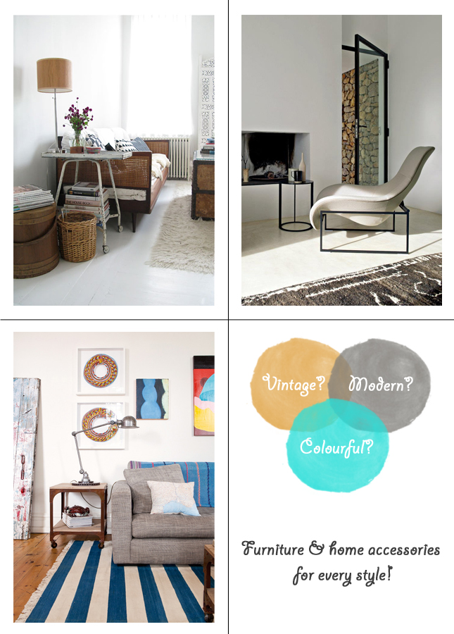
Today it's time to present you one of my very new 'Happy Sponsors', the German online shop milanari.com with a beautiful selection of furniture and home accessories. milanari.com is pretty new on the German market and covers a wide array of interior styles: from vintage pieces, over colourful accessories to modern furniture. The two charming ladies and owners, Jutta Syben and Nicole Mahnel, founded milanari.com in Munich and what I love is that their passion for furniture and home accessories shines through - they pick every piece by themselves and thus create a personal marketplace for happy homes, don't you agree?
1 / 2 / 3 / 4

For this blog post I've compiled some of my favorite finds from milanari.com and grouped them into 'interior personality' boards - being a guy I've opted for a 'masculine' typology, but of course this applies to all you beautiful ladies out there, too! 
1 / 2 / 3 / 4

I am the kind of guy that easily gets lost in online shops with home accessories. I browse, get inspired and eventually I discover something new and beautiful that I want for my happy home. So let's do a little guessing game, shall we?
1 / 2 / 3 / 4

Here is the little guessing game: One of the above depicted home goodies from milanari.com is now in my home. But which one? What do you think? I am curious to see who knows me that well by now to guess right!

This post is kindly sponsored by milanari.com.

Photography: Vintage room via Minna's Playground; Modern room via B&B Italia; Colourful room via Homelife; all product shots via milanari.com.

Thursday, April 25, 2013

Before & After: Home Styling Part Three


Styling your home can be the best activity ever. Trust me. It is so fun and so challenging at the same time. During my interior styling online course by Justina Blakeney I was asked to restyle five areas of my home: The coffee table and sofa (part one, see HERE), the console and bookshelf (part two, see HERE) and the bed & nightstand - today's final part three!

As you see on my pics, my rooftop apartment has pitched roofs and my bedroom is literally stuck under one of those droops. My bedroom furniture is white and a nautical bunting (can't be seen on the pics unfortunately) sets the tone for a maritime vibe in my nook. So I've decided to take the bunting's theme as a key and style a nautical bedroom corner for the 'little sailor' in me.

For the bed I used various textiles to play with textures, patterns and colours. Understandably, the colour palette is muted with blues, off whites, soft greys and a dash of yellow. I combined striped bedsheets with a navy blue knit throw and a Hamam towel. My anchor cushion from H&M Home and the Whitby cushion by Mini Moderns complete the look and call for a seaside dream.

The nightstand is simple and as I would say 'happy'. The nautical themed painting that I brought back from Provincetown sets the frame whereas the coral, the little colourful lighthouse and the succulent in the happy dotted pot recall coastal joy and and add texture, colours and the magical power of botanicals.

What do you think of my bedroom styling? It is simple, I admit, but isn't it happy?

Photography by Igor Josifovic

Wednesday, April 24, 2013

5 Happy Inspirations: A Dash Of Spring For Your Happy Home


With spring in full swing I am thinking of new colours, textures and patterns for the home. Have you done your spring cleaning? Have you sorted out those deco items that have been like forever on the sideboard? How about the selection of home textiles in your home? Time for a revamp? With spring I feel the desire for an airy feeling at home, for fresh colours and blissful textures. In order to give you a more visual idea of what I think, here are this week's five happy inspirations. Oh, and simply scroll over the image to click and shop! As easy as that!

Happy spring day!

Tuesday, April 23, 2013

Why This Room Caught My Eye


Have a look around the room where you are right now - what catches your eye immediately? Those salient visual cues are the essence of my Tuesday blog series 'Why This Room Caught My Eye'. There are always a few visual cues that stand out and make a real design or styling statement. I've committed myself to three elements that catch my eye so today again I want to line out why this room caught my eye. Let's roll:
  • Colourful Illustrations: I am a huge fan of illustrations and I've recently started my little gallery wall. This cute selection of colourful illustrations in the kitchen caught my eye immediately. I like the neat order here and the dominance of kitchen related topics. Cute!
  • Happy Kitchen Appliances: Kitchen appliances haven't got to be dull or boring. Whether you like the sleek look of stainless steel surfaces or you prefer a happy dash of colour - a statement piece of kitchen appliance can brighten up any home! Love the happy yellow here!
  • Stripy Sweater: Ok, I admit, this is not an interior design or styling factor. But hey, after all don't forget that you and your beloved ones make part of a happy home (yes, the most important one). So if your home is a happily styled, so should be you! And there's hardly anything happier than a stripy sweater!
Happy home styling & happy Tuesday, friends!

Photography via Ikea Family Live

Monday, April 22, 2013

BLOGST Munich: Teaching A Blogger Class


The German blogger workshop series called BLOGST came to Munich a few days ago. The workshop in Munich was entitled BLOGST PRO - blogging for advanced bloggers. Ricarda, the mastermind behind BLOGST, asked me whether I'd be interested an co-lecturing the workshop with her and it took me two seconds to consider - I said yes! 

Teaching my first blogger class was pretty exciting. First I was a bit nervous, then uncertain what to teach and then I just had so much fun cause we had the best student bloggers ever in Munich. The days before the workshop I clicked through 22 German lifestyle blogs spanning from DIY over food blogs to fashion blogs and wondered what to teach those advanced blogger ladies. 


During the workshop I talked about time management for busy blogger bees with full-time jobs or families, about editorial calendars, prettying up the blog with Photoshop and about networking. I revealed a few personal tricks and tweaks to blog efficiently, a few freebie sources and networking tips. The feedback was positive so I felt happy and relieved after a long day.

Beside the fact that I was the only guy among 23 ladies, I couldn't help but admire the funky co-working space Combinat56 with its 50s decor. It was the perfect location to let the creative juices flow and work on our blogs.


After a super long workshop Saturday we rounded the things up by having dinner in a downtown restaurant and I felt like I not only accomplished my dreaded task of teaching my first blogger class, but I also gained 22 new blogger friends! I'd say that was worth all the hassle!

Thanks again to Ricarda for making me part of the BLOGST experience! We were a great team!!

Photography by Igor Josifovic

Saturday, April 20, 2013

Ideas For A Happy Weekend


Salut mes amis de la France! Oui, oui, I am back again to my second home, to Paris. I am spending a prolonged weekend over here and I will also make a little French seaside getaway - the full coverage soon on the blog and if you are curious where I'll be, just pop over on Instagram (@igorjosif) to follow me along in real time.

Watch this space for more French inspirations over the coming days and weeks. After all, je t'aime, Paris…à bientôt my friends!

Photography by Igor Josifovic

Friday, April 19, 2013

Exclusive Book Preview: 'A Place Called Home' By Mr. Jason Grant


More than a year ago I presented my favorite Australian stylists HERE on the blog: Mr. Jason Grant. Ever since I was amazed to see his fabulous work more and more in various interior design magazines, even here in Germany. This guy knows interior styling! Now imagine how excited and happy I was when he told me that he has just launched his first book 'A Place Called Home' in Australia and it is about to be published in Europe in June 2013 by his publisher Hardie Grant Books in the UK! Yay! More book love to come!

He was kind enough to send me a few exclusive pages from his brand new book that I want to share with you here. If someone asked me to describe Jason Grant's style in one sentence, I'd say: His styling is eclectic, colourful, relaxed and above all happy. After all, Jason is an Australian guy and the spaces styled by him seem to get that magic touch of an unmistakably Australian laid-back vibe. 


His book 'A Place Called Home' (I love the title, by the way) is a sort of scrapbook with hands-on ideas for your home and inspiring imagery by the photographer James Geer. The showed homes carry that promise of a lived-in space with lots of personality - exactly what we are looking for, right? After all, we all know that the only thing worse than an unstyled home is an over-styled one. 

So, if you feel this is a book for your collection of fab interior titles, you can preorder it HERE. I am already making some place on my bookshelf for this happy book (I am also convinced by the fact that Jason and I have the same socks). Oh, and happy Friday!!


Photography from 'A Place Called Home', styling by Jason Grant, photography by James Geervia Hardie Grant Books


Thursday, April 18, 2013

Before & After: Home Styling Part Two


Last week I wrote about my online interior styling class and I presented the first results - my coffee table and sofa styling. Today, I want to share the second part with you: styling a bookshelf and a console. 

Justina Blakeney's online course was a truly fun experience as we were asked to take 'before & after' pics and apply the '8 principles of styling'. So when I embarked on restyling my upper bookshelf, I've noticed one thing: it was hopefully packed. We learned that things should have a bit of space 'to breathe' in order to avoid a cluttered look. So I took off all knickknacks and a good deal of books, played with vertical and horizontal placement, added a bit of texture and colour with my little House Doctor owl, a dash of bling with my faceted sapphire blue vase and some spring botanicals. When I look at the 'before & after' pic I must admit - this is definitely an improvement.


The console was the next task. I have a lovely wooden console (found at Butlers) with many little drawers painted in various grey and black shades. Funny enough, I'd sort of restyled my console just a few weeks before the course kicked off, so I felt like I had to enhance my styling rather than restyle it completely. 

I liked the colour scheme that included greys, blues and greens so I looked around in my apartment and found a few goodies to add to the vignette: a green, vintage apothecary glass bottle, a weathered blue letter (both from Home Barn) and my quirky plant pot from Atelier Stella with a tiny cactus. I remembered the rule that items should be grouped in odd numbers, and a set of three has a great visual power especially if you combine different heights. Plus, the colours were perfect and ta-dah, my console styling was accomplished!


I really like the outcome of my little styling approaches. What do you think? Do you restyle your home frequently?


Photography by Igor Josifovic


Wednesday, April 17, 2013

5 Happy Inspirations: Nautical Homeware


Imagine a soft sea breeze, salty air, the light scent of pines, soft sand under your feet and the repetitious sound of crushing waves - nothing beats a walk along the beach. But even if you happen to live far away from the sea and the beach you are not doomed to merely fantasize - bring that nautical feel of a maritime sojourn to your home with home accessories. In today's '5 Happy Inspirations' I've compiled a few nautical home goodies to add that touch of seaside feeling into your home. 

Which goodie could make it into your happy home?

P.S. Have you noticed the new 'click & shop' experience? Just scroll over the photography above and links will lead you directly to the online shops of the goodies!


Photography: 1. via Anthropologie; 2. via Lacrimosa Design; 3. via Moon Garden (as seen on decor8); 4. via Human Empire Shop; 5. via Wantful.


Tuesday, April 16, 2013

Why This Room Caught My Eye


It's Tuesday and thus time for a new room that caught my eye. And this week I am more than happy to show you a fabulous bedroom styling from one of my fab classmates in the interior styling class by Justina Blakeney. My fellow styling classmate Valerie Mangum has restyled her bedroom in such an awesome way that I was absolutely smitten and couldn't help but share it here with you. If you want to have a 'before' peek into her bedroom  too, click HERE. But now let's talk 'styling':
  • Various botanicals: One of the styling elements are 'botanicals'. And trust me, I was totally fascinated to see the impact of botanicals in room styling. Valeria has carried out this principle to perfection by adding various botanicals into her bedroom styling and thus adding lots of life and texture to her room.
  • Hanging planters: Botanicals require an adequate container for display. Valeria has gone a step further and has added hanging planters that create a big deal of structure, interest and definitely caught my eye!
  • Colourful & patterned cushions: An excellent selection of colours and patterns when it comes to cushions ties the whole styling concept together. The entire room tells one beautifully arranged styling story.
Well done, Valerie!! What do you think of this room styling?

Photography by Valerie Mangum


Monday, April 15, 2013

From Place To Space: My Athens! Part Two


A new week has started (and spring has sprung) and I am taking you a second time back to the Greek capital, to Athens. Today I want to share a few tips with you should you ever consider a little getaway to Athens.

For many, Athens is just a transit stop on the way to the sunny islands. Mostly, people manage to climb up the ancient Acropolis and dine in the busy tourist quarter Plaka. The rest seems like a giant, grey unattractive sea of buildings. But there is more to Athens than it seems. Last Monday I showed you some of my favorite spots for fabulous bird's eye views. Today, let me take you to some other cool spots in town.


For a relaxed coffee I recommend the tucked away cafés of the Plaka, many of them are located just behind the Old Agora like the Café Yasemi. For a fine dinner I can recommend the swanky 'Eat at Milton's' in the Plaka area or for a more traditional Greek feeling, the hillside placed 'Old Fisherman's Tavern' (I Palia Taverna Tou Psarra - it's depicted here in the blogpost). And while strolling through Plaka and Monastiraki, don't forget to buy a pair of handmade Greek leather sandals - they are super comfy, last for like ever and look fabulous.

For a vibrant and lively night out head to the Gazi district close to the Kerameikos metro station - eat, drink, stroll and dance all at once in places like the cool Gazarte! During day time, don't forget to head down to the seaside quarters such as Glyfada or Voula for a coffee on the beach.
So don't be afraid of the giant, grey city. Athens is a charming place and definitely a great option for a sunny weekend getaway.

Photography by Igor Josifovic

Related Posts Plugin for WordPress, Blogger...