Monday, June 30, 2014

From Place To Space: Elemento In Jaffa, Israel


Here's a typical Monday situation: I am posting about a cool discovery during my last trip to Israel and in the meantime I am right now in Portugal! But I will share more Portugal impressions with you over the next weeks, so let's go back to Israel for a short moment, shall we? Luckily enough I have wonderful local friends in Israel who know the best places, so that's how I ended up in a fantastic interior design shop in the old town of Jaffa: Elemento.


Finding such a cool, contemporary interior design store in the old town of Jaffa is a real visual refreshment. The old town carries its own flavor with ancient stone buildings, a colorful flea market, vintage objects and kilim rugs everywhere. And then you enter one of those old stone buildings and you find yourself amidst contemporary, cool and very urban design with a light Middle Eastern note. 


Walking through the shop was like experiencing a fantastic eclectic concoction of Scandinavian, British and Israeli design, all mixed together to visually appealing and pleasing settings. If you add the fact that the staff is super friendly, you know that it's well worth visiting Elemento if you ever find yourself in that corner of the world.

I hope you enjoyed today's little getaway to Tel Aviv-Jaffa. If you need more travel inspiration, come to Instagram where I am sharing right now my moments from Portugal. See you there!

Elemento, 15 Hazorfim Street, Old Jaffa, Tel Aviv, Israel

Photography by Igor Josifovic

Friday, June 27, 2014

Young Design From Chile: Minka Inhouse


What I love about the internet and being a blogger is the constant discovery of creative people and young design from around the world. Maybe you remember my story about a young design couple from Israel recently - I backed their project on Kickstarter and soon I will own one of their design lamps. Things you can't buy in high street stores, design that have a true story and passion behind them. And these days I've discovered yet another fabulous design project on Kickstarter - this time from the other end of the world, from Chile. Meet 'Minka Inhouse'.


'Minka Inhouse' is the label of the Chilean creative Fran Aldea and was born out of her desire to understand and get involved in each step that goes into developing handcrafted products. Her brave endeavor started with the search of talented local craftsmen that help and teach her to work her two favorite materials - ceramic and wool. So, 'Minka Inhouse' was born in Santiago de Chile. Minka is a native word that describes a collective work with a social purpose and benefit for the community.
Her story is so touching, brave and wonderful, after watching her little video on Kickstarter I was sold immediately. That is how I became one of her backers. And I truly hope that some of you, my dear readers, will support this young creative woman in her pursue of sustainable, handcrafted and good design with a soul.


Here's to many more wonderful design project that will touch our hearts and make us smile with happiness. Like 'Minka Inhouse' does.

Happy weekend, my friends!

Photography via 'Minka Inhouse'

Thursday, June 26, 2014

Urban Jungle Bloggers: Dress Up Your Plants!


It's time to green it up again, friends! Yes, the June edition of Urban Jungle Bloggers is upon us. On our topic this month is: Dress up your plants! Or simply put: Creative plant pot ideas to make your plants and your home happy. While I was searching for a good start to this blog post, I thought I could count my potted plants at home. Now here comes the short reminder that I live on 32 square meters and now guess the number! Ok, I have 26 potted plants at home. And all of them are dressed up in fun plant pots.

Given the limited space at home, I have prepared only three ideas for creative plant pot ideas to inspire your own urban jungle at home. So let's roll, shall we?


Idea 01: Leftover Mugs & Cups
I have a little issue with mugs. Whenever I discover a cool mug, I feel the uncontrollable urge to buy one. The result is a too big collection for my tiny kitchen. So last time I went through my kitchen I found one fun little mug that I bought at the Niagara Falls in Canada and used to store little sugar packages. And there was my first idea born: I thought it would look nice as a little planter. And I think it does. So go through your kitchen and get out those surplus mugs and cups and plant something nice in them!


Idea 02: Chalkboard Paint Pots
During my last London trip I shopped at the West Elm store and found fabulous planters covered with chalkboard paint in different colours. I had to buy a set of three pots and plant some greens in them. I love that you're able to write or draw something on each of them and thus make them even more individual. And no worries if you have no West Elm store around the corner - this is a pretty simple DIY idea, don't you think? Oh and if you wonder where that cute mouse/hedgehog planter is from - it's from West Elm, too!

Idea 03: Handmade Ceramic Bowls
This is the only project that I have not finished yet but I bought recently three very cute handmade ceramic bowls by the Icelandic ceramicist Bjarni Sigurdsson. They are so beautiful, especially since they're irregular in shape and glazing. I can see some miniature cacti or succulents in those but I haven't had the time to find new little plants to add them to these unique planters. Do you have any handmade ceramic pieces at home that are empty and unused? Add a plant to them!

I hope you feel a bit inspired after today's Urban Jungle Bloggers post - make sure you check out my friend Judith's post too for additional inspiration! Oh and all the other participating bloggers will be shared on our Facebook page and Pinterest board! Now it's your turn - dress up your plants!

Urban Jungle Bloggers is a monthly series initiated by 2 bloggers: Igor (Happy Interior Blogand Judith (JOELIX.com). Every month we share ideas to create an urban jungle through styling ideas, DIYs and green tips & tricks. You can find additional inspiration on our Urban Jungle Bloggers Pinterest board and keep up-to-date on our Facebook page. Want to join? Use #urbanjunglebloggers on Twitter and Instagram. Or let us know and we'll share the badge and upcoming topics with you. Let's bring some green into your homes and blogs!


Photography by Igor Josifovic

Wednesday, June 25, 2014

Happy Interior Blog Recommends...


Today it's time to reveal a little plan to you: Next week I will be going to Portugal to learn everything about a great natural material also used in interior design: cork. I have never thought about cork in particular apart from the moments when I'd be sniffing on a cork from a just opened bottle of wine. But recently I have discovered more and more amazing designs made partly or entirely of cork. And the invitation for a press trip to Portugal by the German and Portuguese Cork Association came just in time. So stay tuned on Instagram next week as I will be sharing my corky impressions on-the-go.

A fun side fact is that my friend and travel photographer Sivan Askayo gave me a fantastic present when I met her in Israel this spring: She offered me a beautiful photo she took of the city Porto. I have framed it and placed it on my sideboard and now it is like a little reminder that I will be there and in Lisbon in just a few days. But to make things more tangible and to give you an idea why I think that cork is trending in design, here are a few personal corky favorites:

1. Accessories line PLUG by Tomas Kral/ECAL via PCM Design
2. Coupoles lighting by Seletti
3. Storage jars by MENU
4. Salt and pepper mills by Nendo
5. Corkigami chair by Carlos Ortega Design
6. Pushpin stool/sidetable by Kenyon Yeh for Esaila

What do you think of cork in interiors? Do you own anything made of cork?


Cover photography by Igor Josifovic


Tuesday, June 24, 2014

Why This Room Caught My Eye


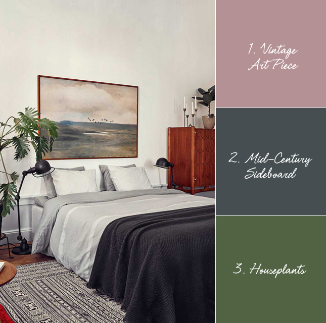
Bedrooms have a special attraction to me. As the most private room in a home they are usually not as accessible to the curious eye of a beholder and the interior styling speaks strongly about the personality of its dweller. As a zone of relaxation and unwinding, some people keep their bedrooms minimalistic and clean, others like to decorate a bit more and some go all the way to liven-up to their eclectic style.

Today's bedroom that caught my eye belongs to the Swedish set & prop stylist Joanna Lavén and is part of her stylish home in Stockholm. The mid-century vibe caught immediately my attention and its grown-up and sophisticated style is definitely a benchmark for bedroom projects. Here's what caught my eye in detail:
  • Vintage Art Piece: Lately I am totally drawn to vintage art pieces. This large, statement piece of art sets the tone in this mid-century inspired bedroom styling.
  • Mid-Century Sideboard: Even though the wooden sideboard is pretty much on the edge of this photography, it caught my eye due to its sleek style and carved fronts.
  • Houseplants: No mid-century styling without houseplants! These two plants perfectly accentuate the room's interior design and enhance the room's climate.
How do you like this bedroom?

Photography by Idha Lindhag via Dustjacket Attic

Monday, June 23, 2014

From Place To Space: Mahlefitz Coffee Roasters & Café In Munich


With all my traveling I sometimes feel alienated to the city I am actually officially living in - Munich in Germany. Often I catch myself being here only for work and once the weekend approaches I am setting off for a new voyage. Result: Sometimes I walk in the evening through the center and wonder what all the new shops are about and other times I wonder where certain shops and restaurants have gone. It reminds me that Munich has lots to offer - not only to its citizens but also to visiting guests. And that's how I happened to discover a brand new coffee roaster and adjacent café in the Munich quarter of Neuhausen - Mahlefitz.


As a true coffee lover it was a task and pleasure to discover this place on a sunny Saturday. Before I reached the actual place I could already smell freshly roasted coffee - plus a fun sign and an inviting lawn in front of the café showed me my way. Inside Mahlefitz I was really surprised by its urban and cool look - something that is rarely found in Munich. The minimalistic, industrial inspired interior concept perfectly works with the transparency achieved by a large glass front separating the roasting area from the café. While you sip on your delicious coffee, you can actually observe how fresh coffee beans are being roasted just on the other side of the glass front. 


But at Mahlefitz it's not all about show. Yes, they do have cool baristas making latte art or brewing exquisit drop over coffee while you are waiting at the coffee bar, but they also take you on a tasty journey through the various coffee growing regions of our planet. Coffee beans of various provenance and different roasting grades and techniques make for a hyper sensory experience for any coffeeholic. And the best: You can buy there own roasts directly in the café. So, if you are in Munich I can only recommend a visit to Mahlefitz if you love coffee. Order a cup of your preferred brew and if you like what you taste, don't forget to take a package or two with you. You know, for the coffee experience at home. Oh and if you need the right gadgets and tools: Mahlefitz also sells all refined and sophisticated coffee accessories for your barista experience at home. 


I hope you enjoyed today's little coffee story and visit to Munich. Maybe with a cup of coffee in your hands. And now off we go into this Monday. Happy new week!

Photography by Igor Josifovic

Friday, June 20, 2014

Art Crush: Decorating Your Walls With Lumitrix


According to my love for illustrations, photography and any other wall art, I should live in a palace with an abundance of free wall space to decorate and redecorate. Alas, reality tells another story. The story of very limited wall space and a pile of framed wall art stored in a corner of my apartment. However, nothing could hold me back to add one amazing piece of art photography to my abode - a large photo of Bondi Beach by Australian photographer Louisa Seton, exclusively sold on Lumitrix.

The atmospheric photography simulates an airy feeling and seems to emanate a light sea breeze and salty ocean mist. This incredibly calming vibe seems not to be disturbed by the numerous bathers populating the famous beach - to the contrary. The juxtaposition of a lively beach scene with an almost elusive atmosphere has a strong visual power - it fascinates me day in, day out.


When I received the art print from Lumitrix I had to decide on the proper framing (but you can also order any photography framed). My choice was a light, thin wooden frame made of beech to complement the airy photography. And I had to decide on the appropriate place to mount it. Since my space is limited, the choice was quickly made. I decided to add it to my bedroom nook thus creating a light, sea inspired bedroom atmosphere (well, I happened to have the ideal bedlinen to colour match the photography).

Lumitrix's motto is 'see, love, frame' - and it basically rounds-up my personal experience. Their mission is to offer fine art photography at an affordable price tag - currently most of their fine art photographies are available for 50 pounds each, as numbered editions of 500. However, as of coming week, Lumitrix will be launching a fine art range with more collectable pieces and different sizes including a wider price span. So if you have been looking for that very beautiful fine art photography to adorn your home, look no further: Lumitrix is a fab source with a great selection and quick delivery. 

Happy decorating & happy weekend!


Photography by Igor Josifovic, other images by Lumitrix
This blog post has been brought to you in collaboration with Lumitrix

Related Posts Plugin for WordPress, Blogger...