Friday, May 30, 2014

Home Tour In Llamas Valley Magazine


I am pretty happy about all the positive feedback I get whenever I share some glimpses into my tiny apartment. Most friends tell me that my apartment looks way bigger when I take photos and share it, but in fact it still is and will remain a teenie-tiny rooftop apartment with 32 square meters. Nevertheless, this was not a scary obstacle for the folks of the interiors e-magazine Llamas Valley and they approached me and asked me to invited them for a little home tour. My answer was quick: Yes, you are welcome!


A few weeks later I welcomed one of their freelance photographers, Lina Gavénaité, to my home and invited my friend and fellow blogger Bridgee over too. I thought it would be nice to invite them to a cup of coffee and then we will discuss the Hollywood-like settings and angles to make the best out of this little cave. 


But Lina is a professional. From the moment she arrived she unpacked half a dozen of objectives, her tripod and screened with her eyes all corners and photo opps. While I was brewing the coffee, she was half through the shooting. Oh my, can I be a professional photographer too one day? Pretty please?!


The editor-in-chief of Llamas Valley Magazine sent over a few interview questions and you can see and read the full home story in their latest issue HERE. And well, if you ever happen to be around, you're welcome to join me for a cup of coffee, too!

Happy weekend from Munich!

Photography by Lina Gavénaité

Thursday, May 29, 2014

Design Chair Crush: Leya By 'Freifrau'


Design chairs are something like 'hot stuff' for interior design aficionados. You know, just name dropping like Eames chair, Wishbone chair, Egg chair, the CH07 or 'Smiling chair' by Wegner - just to mention a few. Design lovers get big eyes and phrases of awe and praise cascade out of their mouths. Very normal! But as many things in life, the story has another side too. Most of those highly appraised chairs have a price tag that requires either a hereditary fortune or several years of saving - and then we've gotten to one chair! Moreover, some of those amazing chairs (not all of course) seem to lack one important feature - a comfy seating. Good for the eye, not so good for your back. Many aspects to consider!

And then I met Leya. A chair with an exotic name like a beauty from the shores of an unknown country. However, Leya is German, yup, she's literally my neighbor. Better yet: she is my new roomie!

Leya is the dulcet name of a beautiful chair from the German manufacturer 'Freifrau' and designed by Birgit Hoffmann. The design label 'Freifrau' was founded in 2012 and is specialized in the design and production of top-notch chairs. Leya is one of their flagship chairs: It is the chair of contrasts, it combines warm and cold materials, hard and soft surfaces, a masculine and feminine touch. The wired base has an industrial touch whereas the soft leather upholstery recalls a lounge feeling. Plus it comes at a very affordable price tag for a design chair. But the best is yet to come!

Visually, this chair is definitely appealing to my eye. But the moment of revelation occurs once you take a seat. So far, this is the comfiest chair I have ever sat on. It is solid yet soft, stable yet puffy. Ever since it moved in with me it has become my favorite chair to read and work. My apartment is too small for a dedicated home office, so this chairs takes the position of a home office slash reading nook. And in fact, I can't wait for the day when I move into a bigger apartment and have a proper desk. Guess which chair will be accompanying my desk then? Yup, her name is Leya. And I like her very much.

Photography by Bridgee Melling & Igor Josifovic
This blog post has been brought to you in collaboration with 'Freifrau'


Wednesday, May 28, 2014

Happy Interior Blog Recommends: Skandinavisk


I am a mixed breed but one thing I can reassure you: I have no Scandinavian genes in my body. Yet I am drawn to a certain Scandinavian notion of interiors and interior styling. And to quite a few Scandinavian brands. One of those is a young brand that I discovered in Copenhagen last year: Skandinavisk. A truly Scandinavian brand founded by two English guys who fell in love with two Scandinavian girls - now this I call a happy brand DNA!

Skandinavisk is a celebration of Scandinavian lifestyle, of vast silent landscapes, of cosy shared moments, of the world's happiest peoples. Of hygge. I couldn't put it better than what they're saying about themselves. When I met them in Copenhagen I was immediately drawn to their beautifully designed scented candles. In the meantime, they've extended their range with adorably happy tableware collection named FIKA (I blogged about it HERE).


Today, I am focusing on one of their scented candles with the mysterious name Ø. What looks like a weird letter is in fact an entire word bearing the promise of freedom, air, sea and wilderness - it means 'island' in Danish. It is inspired by hundreds of thousands uninhabited islands scattered across Scandinavian waters. It carries the poetic promise of the 'solitude of the archipelagos'

Now as someone who had spent a part of his life in Greece on the shores of the Aegean sea I couldn't help but give the candle a Mediterranean twist. And this is the result. A salty breeze, the sound of the sea, the scent of a happy escape to the island. 

Happy hump day!

Photography by Igor Josifovic


Tuesday, May 27, 2014

Why This Room Caught My Eye


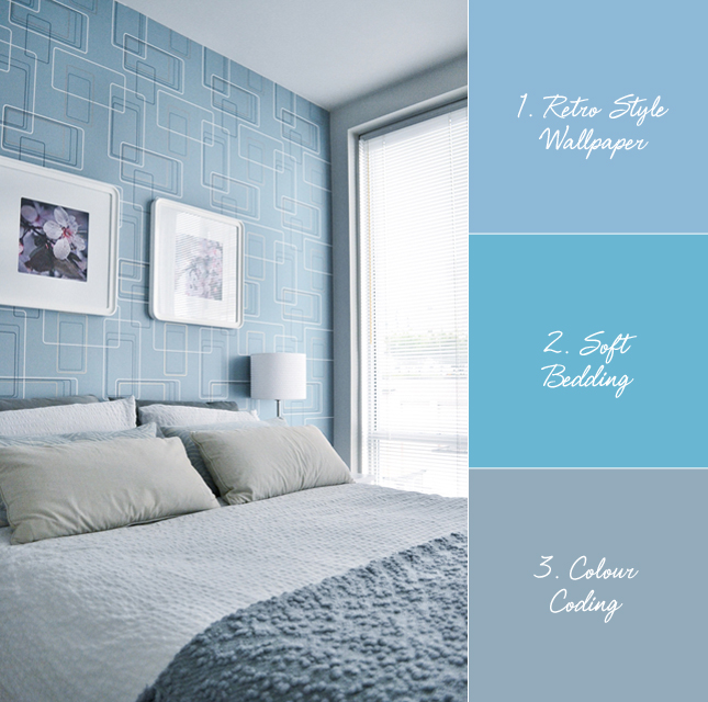
Whenever I get asked to describe my interior style, I use expressions like 'Scandinavian inspired', 'ethnic elements', 'colour pops'. I think I have never used the word 'retro' to describe my own style. Of course the reason is: My personal interior style is not retro at all. But I've noticed one phenomenon, especially on Pinterest: I also like interiors that represent a style that I wouldn't want to live in constantly. Maybe that's what retro means to me in interiors. Anyways, this intro aims at today's room that caught my eye: a very retro inspired bedroom.

In fact, I've slept in that bed for quite a few nights last year when I went to Vancouver, Canada. It is a very retro inspired airbnb apartment in a historic building in downtown Vancouver. The dominating colour was a petrol hue with blue and earthy hues, giving the entire apartment a sort of quirky 60s vibe. You can see the whole tour of the apartment in my guest post on Roombeez. The bedroom caught my eye in particular as I was fascinated by the spacey wallpaper design and the blue hues. But let me put it in bullet points:
  • Retro Style Wallpaper: The wallpaper is an instant eye-catcher. It has the perfect grayish blue colour to suit the rest of the room and the pattern is sort of delirious - pretty fun!
  • Soft Bedding: Something I appreciate in North America - the bedding is always super soft and comfy. Here too, a great mix of textiles create a multi-tactile feeling and super soft sleeping base.
  • Colour Coding: The interior design is carried out with utmost care. It is reduced but the shapes, colours and materials are well coordinated - the quickest eye-catcher being the blue colour coding in this bedroom.
Are you a retro person? Or is it too crazy for you?

Photography by Igor Josifovic

Monday, May 26, 2014

From Place To Space: Visiting Old Jerusalem


Some travel destinations are overwhelmingly captive - they emanate a limitless number of impressions addressing all your senses, they flip through centuries, no millennia, with every second step you take, they blend sounds and scents, languages, cultures, religions. Quiet, abandoned alleys alternate with loud, bustling streets and squares. They leave you in awe. Between fascination and exhaustion. One of those destinations is Jerusalem.


This level of inspirational overload leaves me even now in a sort of writer perplexity. I don't know where to start and where to end this story. I encountered too many moments that were special, better said unique and really moving. But I will try to summarize some of my most important moments in words - for the rest I will let the pictures 'talk' to you.


During my Israel trip I spent two full days in Jerusalem, the controversial capital, the divided city, the center of three monotheistic religions. The change between Tel Aviv and Jerusalem couldn't be bigger even thought a mere 50 kilometers separates both cities. You switch from a coastal to a hillside city, from a very liberal, easy-going beach population to a rather conservative, religious population. You switch from a city drafted and built in the past century to an ancient city dating back to 5.000 years of inhabited history. 


My first day in Jerusalem was marked by a 'historic walk' throughout the old town to grasp an understanding of its variety and dimensions. I walked through the Muslim quarter, the Jewish quarter, the Christian quarter and the Armenian quarter. I walked through narrow streets with colorful markets and souks and finally arrived at a sign indicating: Western Wall. This marked the beginning of my discovery trail of the important religious monuments in Jerusalem.


Approaching the Western Wall was a magnificent feeling, something slightly bewildering, a mix between curiosity, devotion and reverence. Of course I used the opportunity to stick a little paper with my wish into the ancient wall and say a little prayer. Later on, I walked the entire Via Dolorosa and visited every single stop along it - not alone of course, but with dozens of pilgrims from all over the world. 


The trail ends at the overwhelming Church of the Holy Sepulchre in the heart of the Christian quarter.  In fact, the church is a conglomerate of many churches and chapels under one roof and is said to be constructed over the Golgotha hill where Jesus was crucified and his close-by tomb. Despite the numerous visitors the church effused an elevating atmosphere of prayers and admiration. And the moment when I approached the Holy Sepulchre was very special and personally moving (look at my happy face when I left the church further down). That said, patience comes in the package too as you have to queue for most of the important sights within the church. Finally, I wanted to visit the Dome of the Rock and the Al-Aksa Mosque from close-by but I was not lucky enough - the two official entrances to the Temple Mount for foreigners were closed that day.


The second day was another one of discovery. First I visited the ancient City of David taking me back to the millennia-long history of Jerusalem including a fascinating walk through a subterranean water tunnel - I walked around 30 minutes through a very narrow and pitch-dark tunnel with my feet in water with my friend Sarah. The only source of light: The flashlight app on our iPhones. What a crazy adventure it was. Unfortunately, no pictures to share with you as it was - you remember - pitch dark! Everything was topped with a visit to the Mount of Olives with stunning views of the old town of Jerusalem. 


Jerusalem is an amazing place to visit. Especially if you are interested in history. It is like a navel between the past, the present and the future with the levitating eternal question: Will this city be one day not only the capital of a country and three religions but also the capital of peace? A wish well worth to be sticked into the Western Wall. Happy Monday everyone! Oh, and shalom!


Photography by Igor Josifovic

Friday, May 23, 2014

My Sweet Weakness: Studio Oink


By now it is no secret anymore that I am a huge fan of Studio Oink. No, actually I am afraid that Lea Korzeczek and Matthias Hiller, the two masterminds behind the interior design and styling brand Studio Oink might think that I am a crazy stalker. Recently I guest blogged about them on my friend's blog My Paradissi and on the blog of the interiors community Woont.


I might be a Studio Oink stalker, but in a positive sense - I mean I am one of their regular customers whenever they update their online shop 'Studio Oink Selected'. This week they updated their store with beautiful handmade and vintage one-of-a-kind pieces and I shopped twice on the same day. To be honest, I had to stop myself cause I wanted to buy way more. I am looking forward to share my latest buys with you soon. In the meantime here is a photo of the Danish vintage ceramics and the blue vase I bought last month from their online store. 

If you love vintage pieces and handmade home accessories, check out their store now!

Happy weekend friends!

Photography via Studio Oink, last shot by Igor Josifovic
Related Posts Plugin for WordPress, Blogger...