Monday, December 23, 2013

Happy Holiday Season!


Can it get any more festive? One day to Christmas and the entire city is dipped in a festive, glittery atmosphere. That is all minus the snow and cold temperatures. I don't know how it is where you guys are, but here the forecast for tomorrow says 15 degrees Celsius. Well, it's a sort of Mediterranean Christmas Eve in Munich. Hence, I thought all those evergreens look a bit out of place with this mild climate so I went off to the farmers' market yesterday and bought a bunch of olive twigs. 

I love the green-silver shimmer of the olive leaves, the dash of Mediterranean lightness and sunshine that seems to be present in my home now, I really really like it. I placed them in my little Mediterranean, dip-dyed pot and played around with a few elements to create a little vignette - typical Christmas fruits, another clay pot, a painting of a Bohemian from the Balkans in a vintage frame - I couldn't decide which one I liked best so I've put them together in a little animation for you.

Herewith I am wishing you all a very merry, happy festive season wherever you are and whatever the weather is there. Enjoy the holidays and surround yourself with the people and things you love! I will take some days off too, after Christmas I will be heading to Paris for New Year's Eve so if you want to join me follow me along on Instagram. I will see you back here in 2014! Happy, happy, happy season my friends!

Photography & Styling by Igor Josifovic

Friday, December 20, 2013

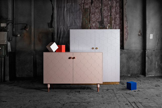
Style Up Your Ikea Cabinets With 'Superfront'


I am often asked what I think of Ikea furniture as an interior design blogger. My answer is always: I like Ikea for it democratized Scandinavian design and made it appreciated and affordable all around the world. But as with any other brand I do not like interiors that are solely equipped with furniture from one store or brand. It is the individual mix and match that makes a home unique and adds character. I also like when people get creative and tweak their Ikea furniture to make them different. Currently, there are a few companies out on the market supporting interior fans when they want to individualize their Ikea furniture. One of them is the pretty new Swedish brand 'Superfront', founded in March 2013 by Mick Born, Sander Aarts and Monica Born.


'Superfront' designs fronts, side panels, handles, tops and legs for some of the most favorite Ikea cabinets like Bestå sideboards and cupboards, Faktum and Metod kitchen cabinets and Pax wardrobes. Interior design fans can combine Ikea's furniture with etched patterns and details in robust classic materials like brass, copper, marble, birch wood and leather. 


One of the founders explains the inspiration for 'Superfront': "We noticed a very clear pattern among our friends and acquaintances. Almost all of them had some sort of cabinet base from Ikea that they had pimped with specially made doors from a local carpenter. Many of them even added marble tops. It was a bit like seeing Ikea dressed in Prada", says Mick Born. 


The wide assortment of fronts and accessories enables almost endless combinations. And all this comes with a very reasonable price tag. Thus, your Ikea furniture will not only become individual but will also look way more expensive than it actually is - a good deal for both, your design loving eye and your wallet.


Photography via 'Superfront'

Thursday, December 19, 2013

Design In Berlin: Styling For 'Fashion For Home'


This Monday I have told you about our great design blogger tour to Berlin in THIS post. Today I want to continue with the design story from the German capital by showing you one of the highlights: Our styling challenge for Berlin based 'Fashion for Home'

Some of you know that I am a fan of 'Fashion for Home' - for example, my coffee table is from one of their collection and I blogged about it HERE. It was a frosty Friday morning when we set off to go to their showroom in Berlin-Mitte. I need not mention that I had a terrible cold and literally no voice at all, but I fought my way through a crazy snowstorm in Berlin (see the breakfast pic) and arrived a tad exhausted at the showroom. Luckily, the folks of 'Fashion for Home' prepared a great and festive breakfast for us all and one of the founders, who founded the company as fellow students back in 2009, gave us an introduction to the brand's beginning and philosophy. Key beliefs of this brand are design for every budget and environmentally friendly processes. 


After the introduction we were challenged as stylists. Our group was split into two and I teamed up with Emma of Emmas Designblogg, Desiree of Vosgesparis and Anna of La Maison d'Anna G. We decided to style up a real-life setting of a dining room. The other group opted for a product styling with various home accessories. We were lucky to work with a professional photographer and what I like in particular about such styling challenges is that we get to do everything from A to Z in a short time - we have to come up with an idea and a concept, find the best spot, ascertain the light, source the furniture and props, brief the photographer, style, restyle, double check the shots, discuss, change and then signing the final shot off.

Now even though both our stylings are totally different, I could not decide which one I like more. Our styling has a more real-life setting, whereas the other one is a more catalog like product styling. Do you have a favorite?

Photography: Final styling shots via 'Fashion for Home', rest by Igor Josifovic
This post has been brought to you in collaboration with 'Fashion for Home'

Wednesday, December 18, 2013

Happy Interior Blog Recommends...


Ok, I am not going to harass you with more Christmas inspired recommendations. I am through with my Christmas gift shopping and now I am sort of yearning for some other inspiration - products to refresh the home for a new year and past the festive decoration. Well, probably it is a tad too early as Christmas is yet to come, but here are just a few suggestions for a fresh kick-start in the new year with a new home:

1. 'Bearded Man' poster by Ruth Landesa via Nama
2. Forest photography via Etsy
3. Ceramic beach houses by 'Not On The High Street'
4. Eames book by Taschen
5. Zig Zag rug by Design Folia

Happy hump day everyone!

Tuesday, December 17, 2013

Why This Room Caught My Eye


Forget cold temperatures, wet weather, gloomy days - the winter has one very positive side, too: You get really cosy at home. Ok, there might be a few more positive aspects of winter, but hey, this is a blog about interior design, right? So when I set off to find another eye-catching room, I stopped at this living room styling. The cosiness is almost tangible and I kept looking at it and getting ideas for my own living room. Thus, I knew this is definitely a room that caught my eye. And why it that? Here are three main reasons why this room caught my eye:
  • Layers of Textiles: I do have a few obsessions when it comes to home accessories. One of them is home textiles. I have way too many cushions, blankets and throws at home. But looking at this picture and considering the cold winter outside - can you ever have too many blankets and cushions? Nope. Layer them on your sofa or bed to create the ultimate cosiness of a warm home and please the eye with various textures and patterns.
  • Serene Colour Palette: Winter always brings a desire for calming, soothing colours in my home. I like to tone it down during the colder season - bright colours are replaced by neutrals and more subtle, smooth hues. Grey is fabulous basis to work on your colour palette with serene hues like blues, greens, saturated ochres. 
  • Cacti: As an avid urban jungle blogger I couldn't help but notice the two little cacti in this room. I love them and they are so simple to take care of plus they add visual interest with their various shapes and surfaces - opt for a few small ones or a bigger one to add that green vibe to your interiors.
How do you like today's room? Is it catching your eye?

Photography via The Design Chaser

Monday, December 16, 2013

From Place To Space: Design Fun In Berlin


Two weeks ago I set off for an early bird flight from Munich to Berlin to attend a four days design blogger tour in the German capital. This was the second design blogger tour after Copenhagen. I was looking forward to meeting my fellow bloggers and friends and exploring design in the popular city of Berlin. Even though I had a slight cold (which turned into a nasty cold leaving me without voice in the midst of Berlin snowstorms), I was determined to enjoy to the max. And so I did.


We were based in the hip Michelberger Hotel in Eastern Berlin and had a fun-filled agenda. One highlight was a styling challenge for 'Fashion for Home', but I will tell you more about it in a later post. Another great part was a 'Green Design Tour' guided by GoArt! Berlin, customized for us by our hosts from 'Visit Berlin'. First they took us out for dinner to a über-cool Berlin-style vegetarian restaurant and club called 'Cookies Cream' (hidden in a gloomy backyard). And the next day they guided us to some amazing stores, studios, museums and ateliers with a focus on sustainable, local design. Let me take you along.


We started off in an old brewery that turned into a cultural center and strolled down the street to the art and architecture center AEDES where we enjoyed a special opening of their current exhibition on new architectural project around the globe. This was followed by a fabulous atelier/shop called 'Heer', where the founder's grandchild Daniel Heer continues a family tradition of manufacturing leather mattresses filled with horsehair, leather furniture and bags - the place was a real gem and the story and work of Daniel Heer beyond fascinating. I enjoyed so much the fact that a young man strives for a career in manufacturing high-quality goods and perpetuating a long lasting family tradition.


Absolutely inspired we set off to discover a great shop with a fun name: 'Noodles, Noodles & Noodles'. The owner introduced us to the philosophy of the sustainably produced furniture pieces and made us regret we came by plane cause we couldn't buy anything of the great design pieces. The official tour was rounded up by a visit to a fantastic photo studio called 'Imago' where you can take 1:1 sized black and white photos of yourself with a retro vibe. Happy and tired we enjoyed lunch with our nice hosts before we decided to check out more stores by ourselves.


We visited the huge Modulor store with all kind of stationery and DIY equipment, the fabulous concept store Voo in Kreuzberg, the Berlin office of the Stockholm-based real estate agency 'Fantastic Franck' and the design concept store 'Supergrau Apartment' where we were invited to dine with the staff. It's pretty logic that even a design tour needs to be fed well, so we gladly accepted another lunch invitation by the folks over at the German headquarters of Etsy


After lot of walking, fighting the snowstorm and fierce winds, after gallons of ginger tea with honey and layers and layers of warm clothing, I was happy and tired back in Munich. And I still have more to tell you. But that I will keep for another post. Happy new week, friends!


Photography by Igor Josifovic, photo no. 4 by Riikka Kantinkoski
Related Posts Plugin for WordPress, Blogger...